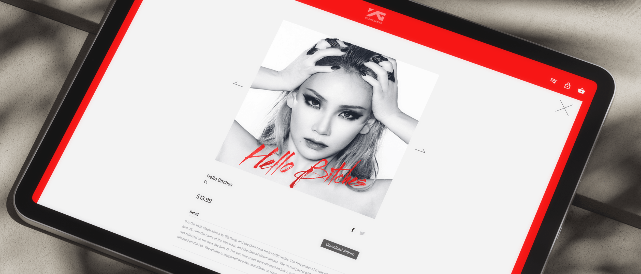
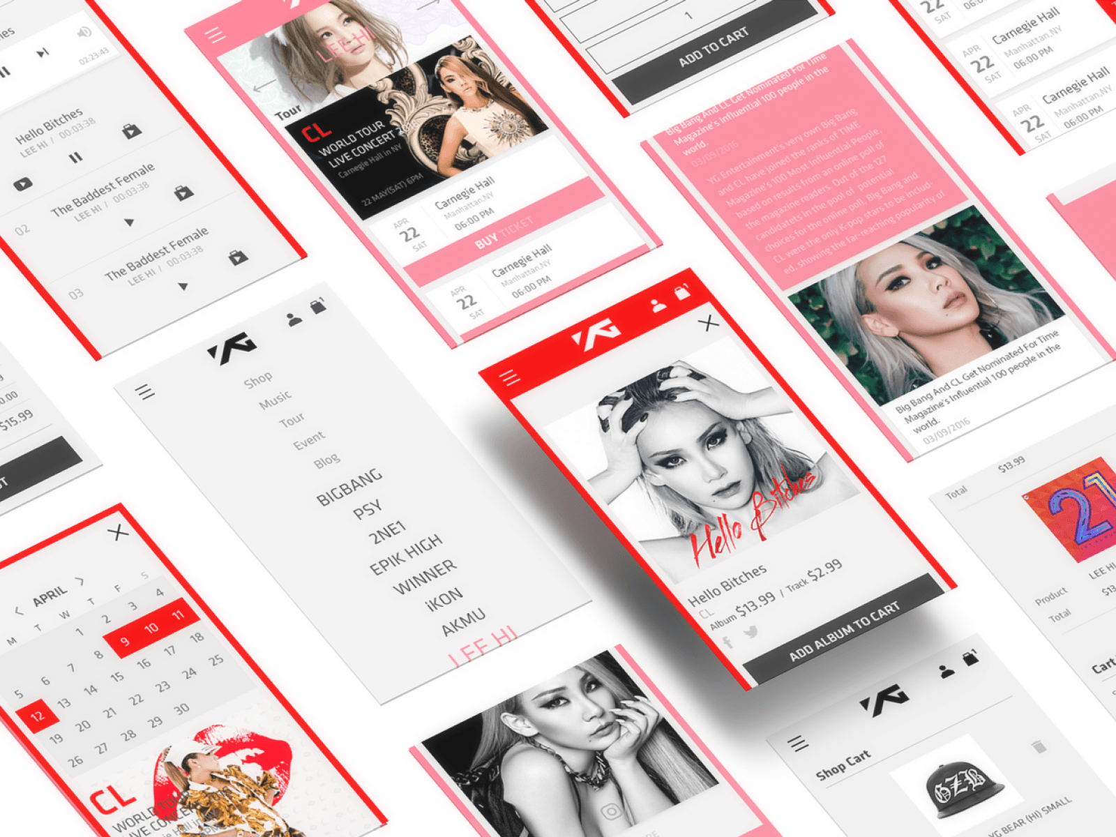
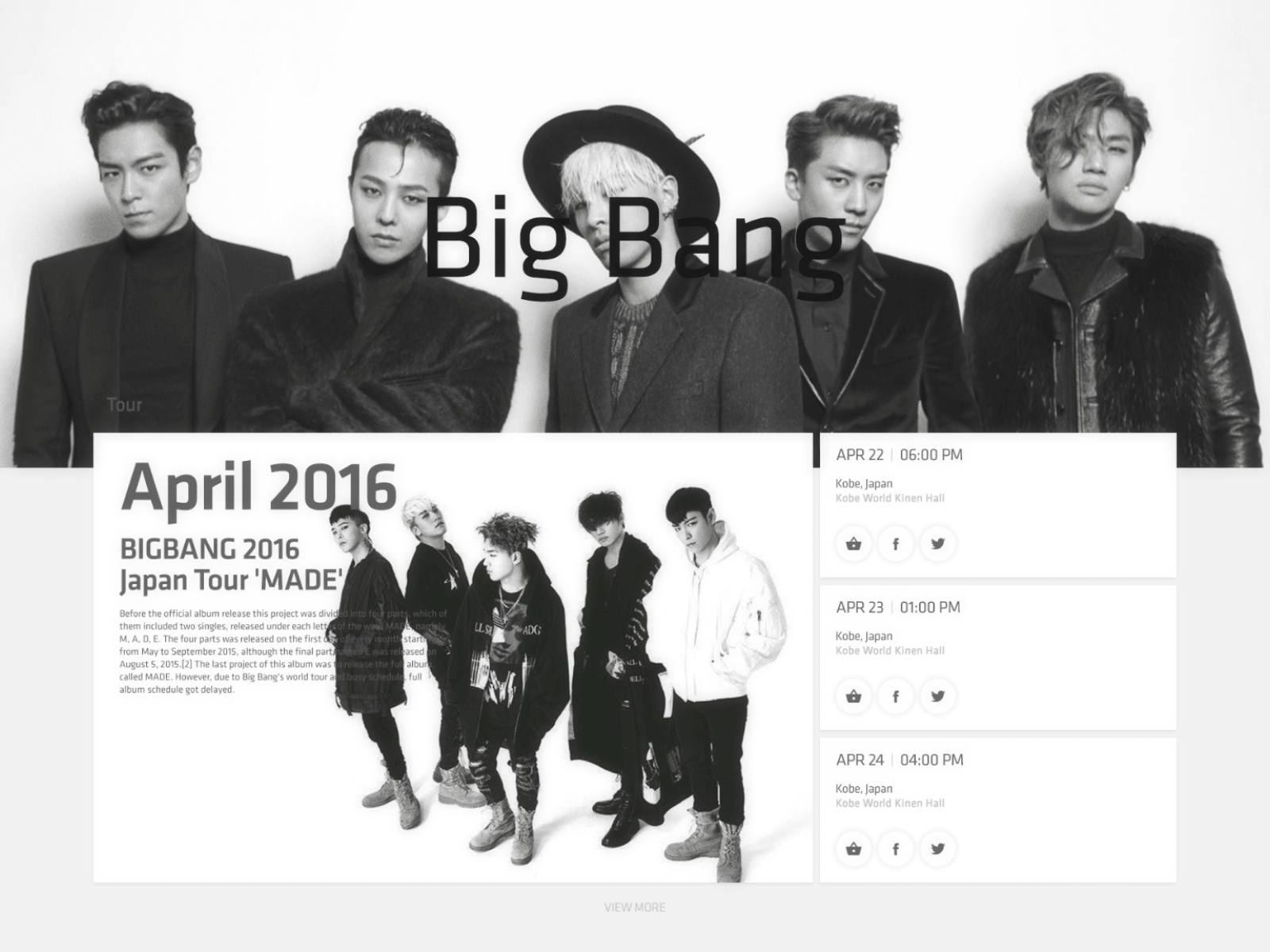
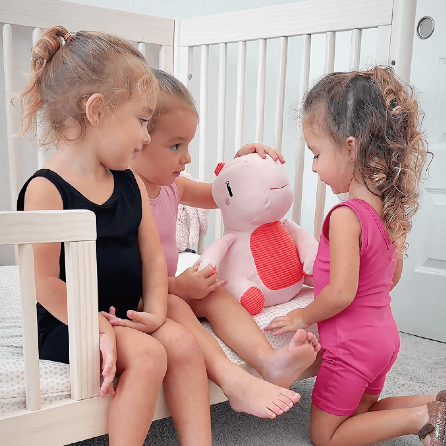
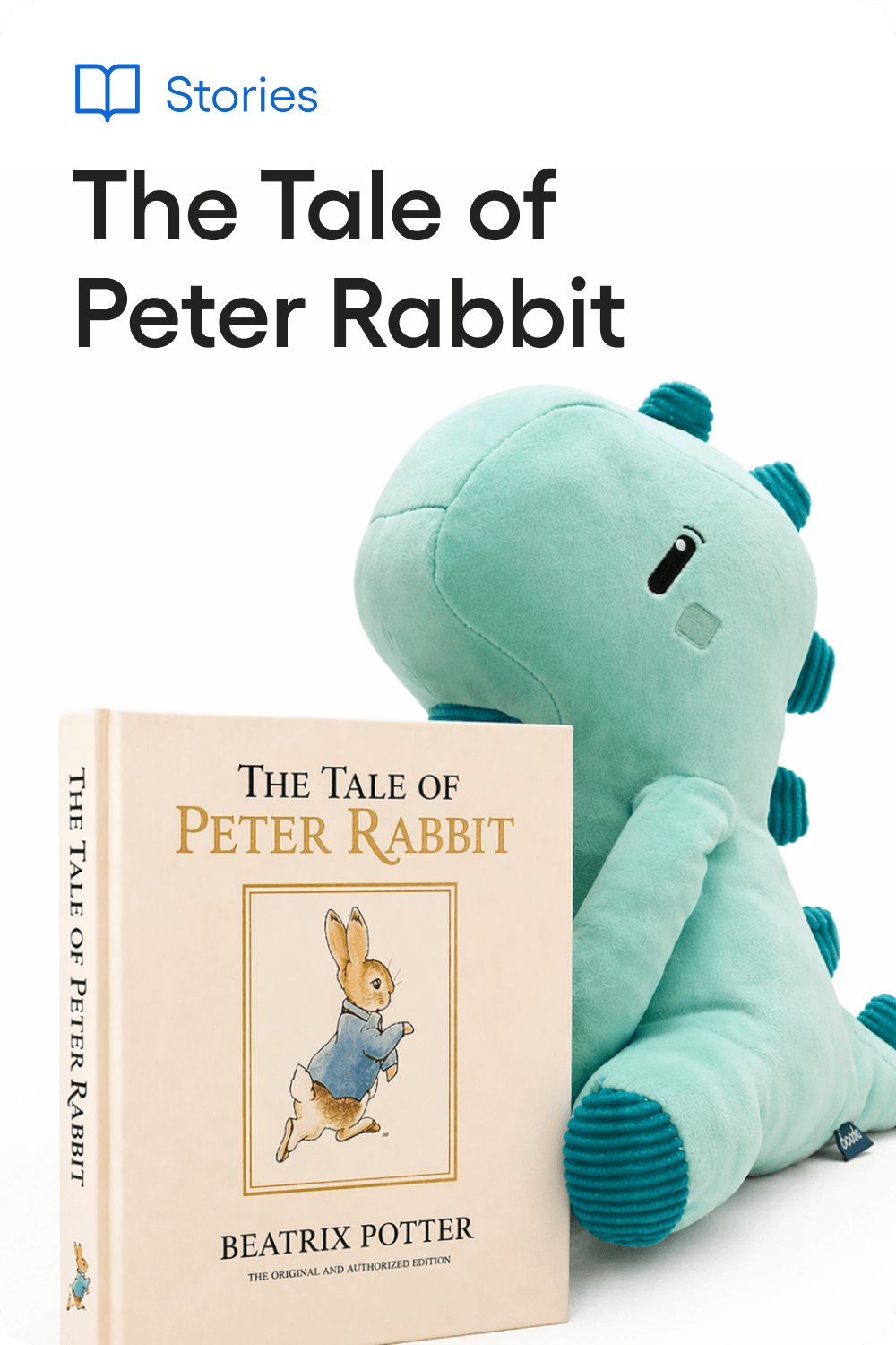
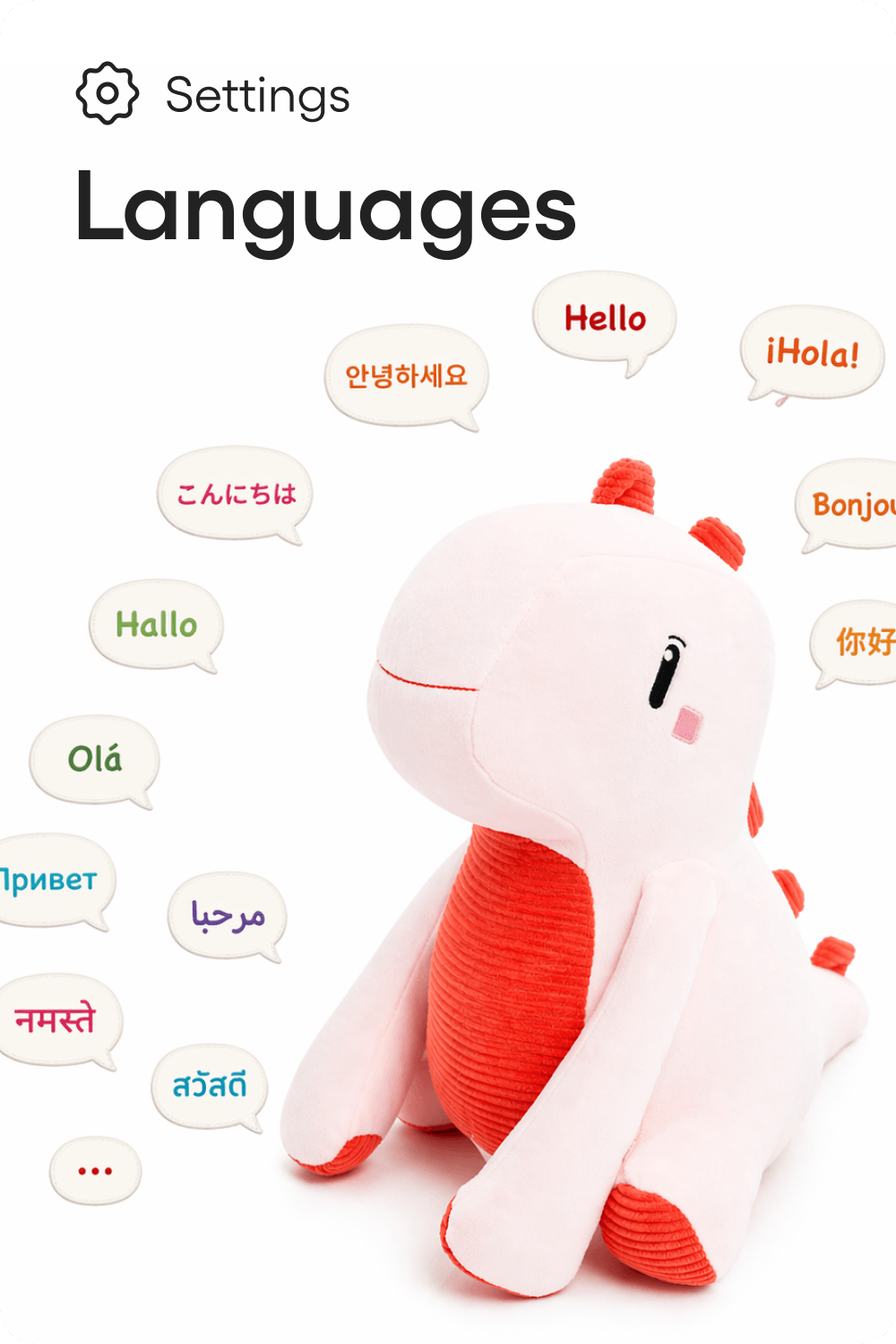
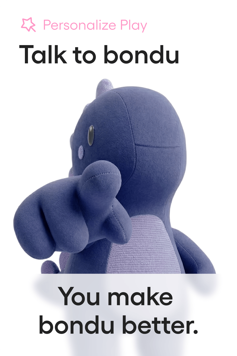
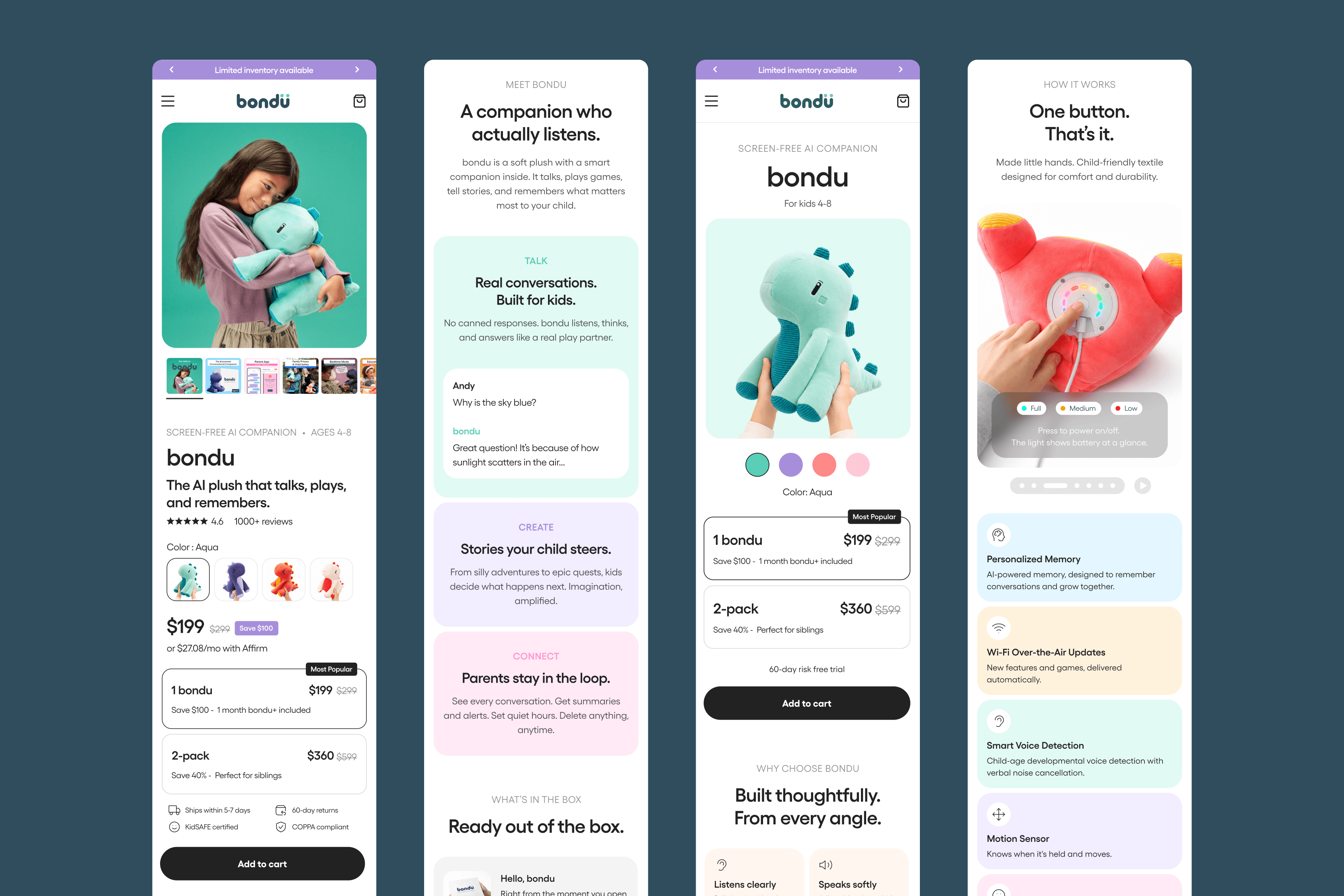
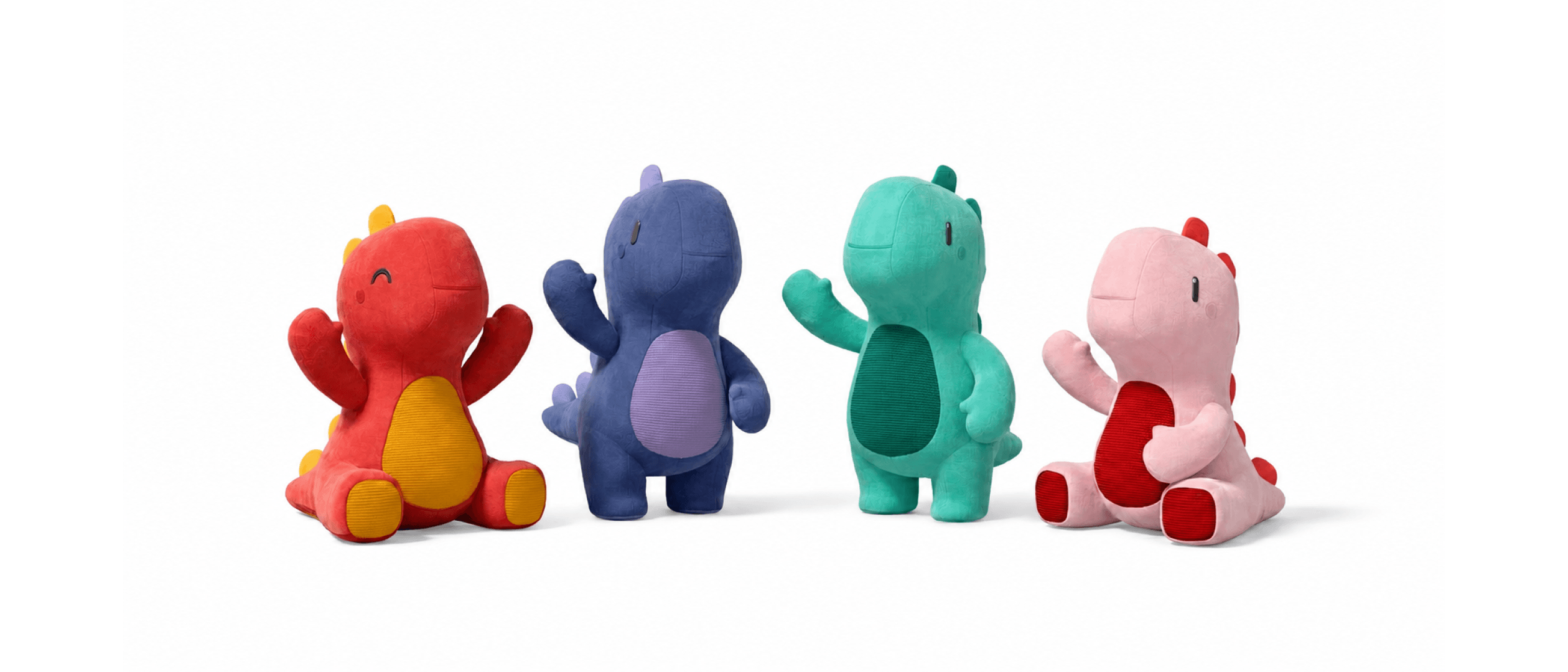
Selected Work
 bondu/thumb.png · 4:5
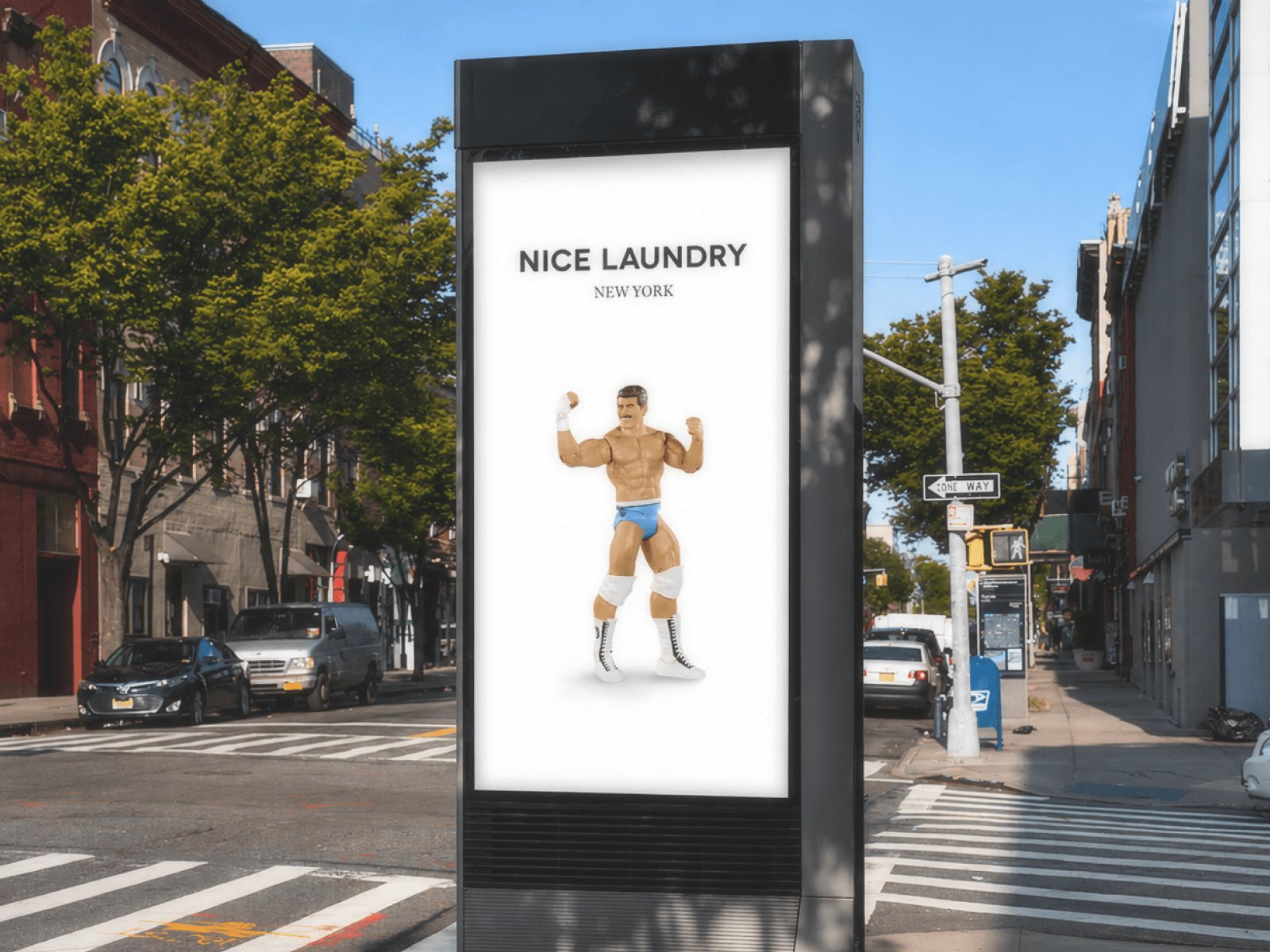
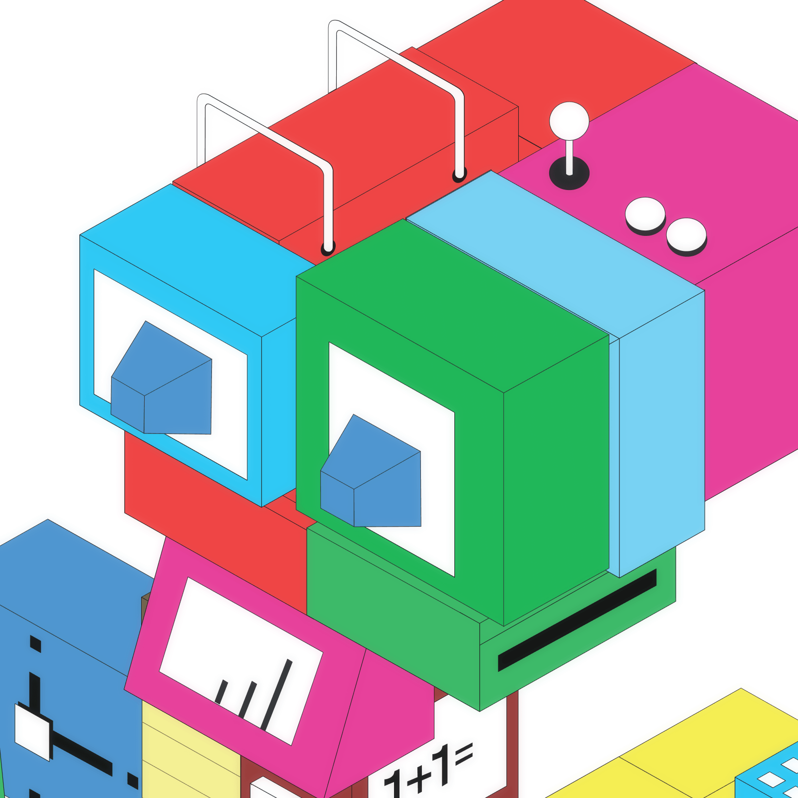
bondu
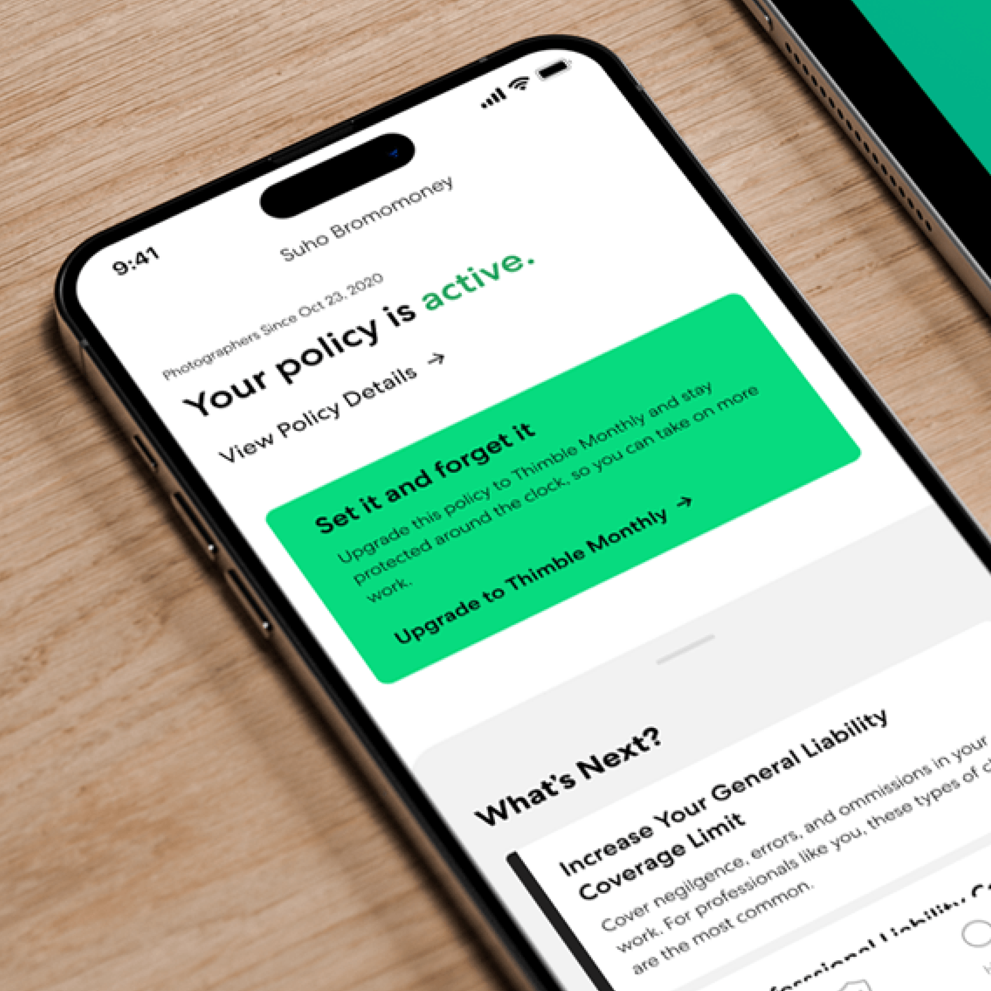 thimble-1/thumb.png · 1:1
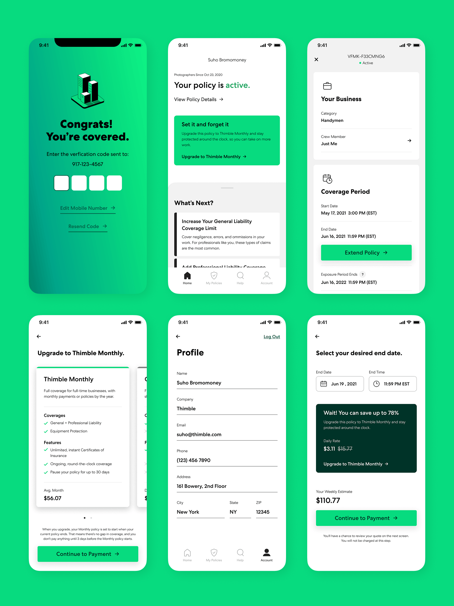
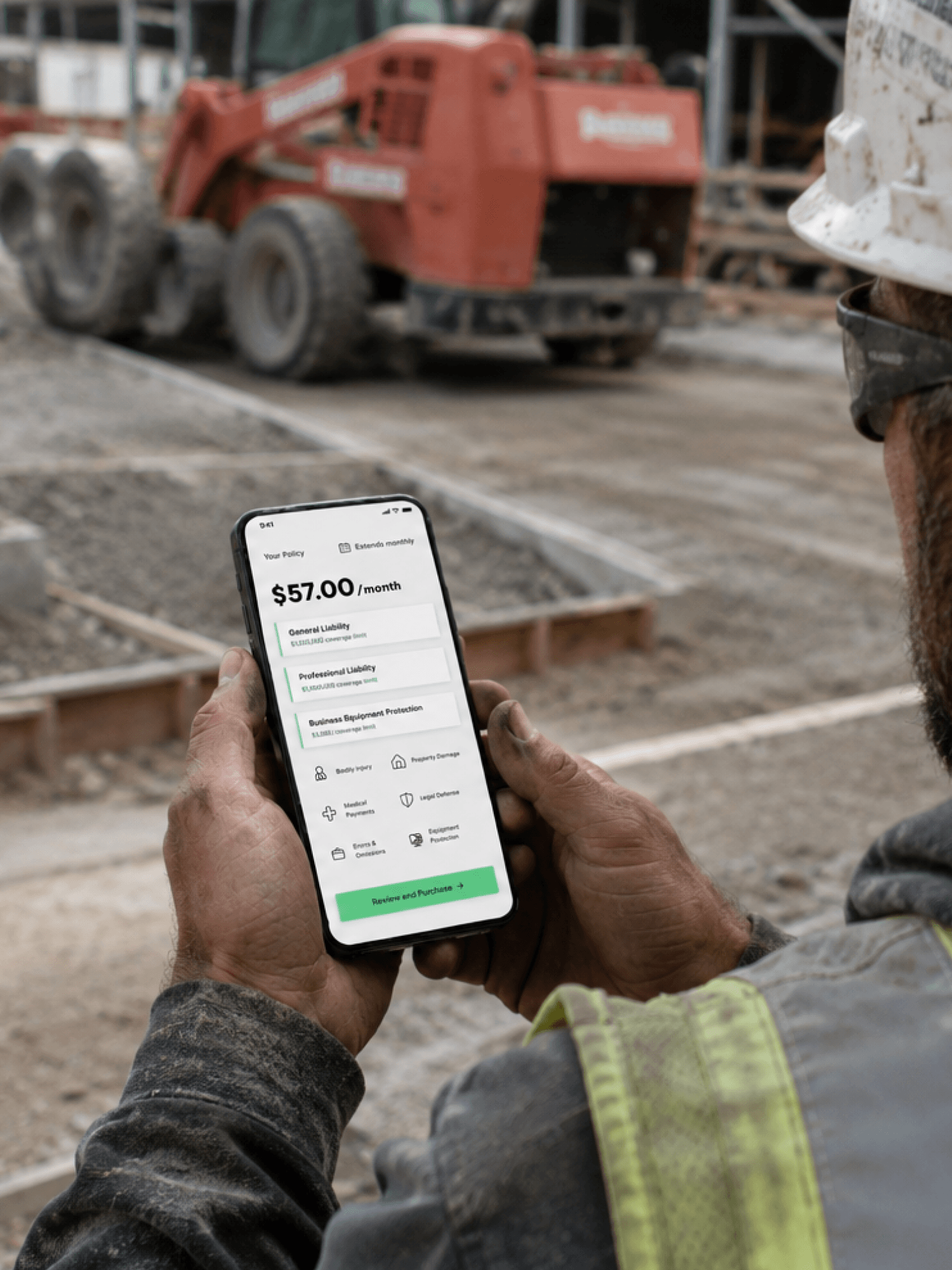
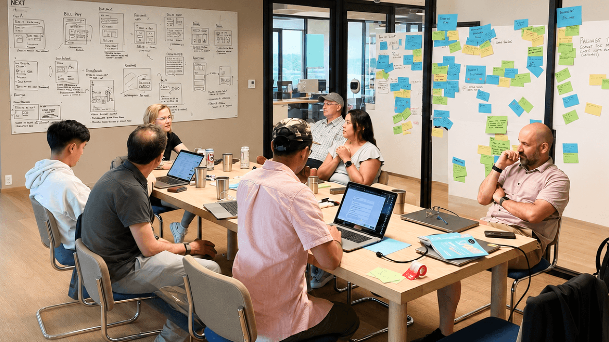
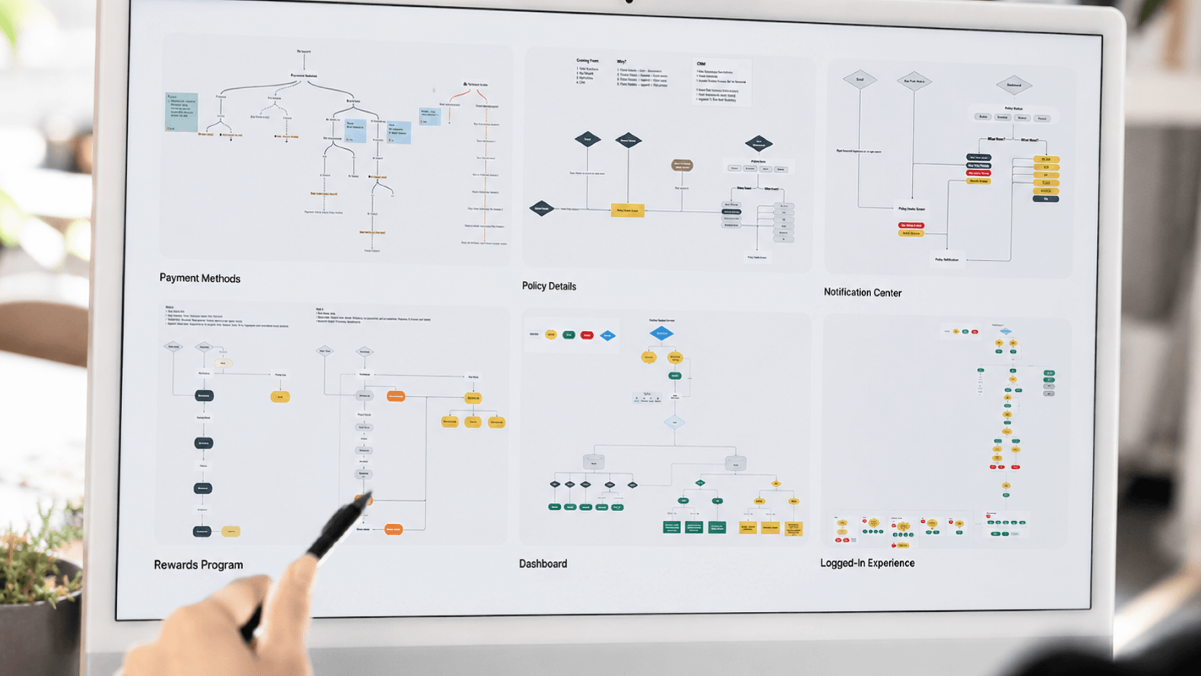
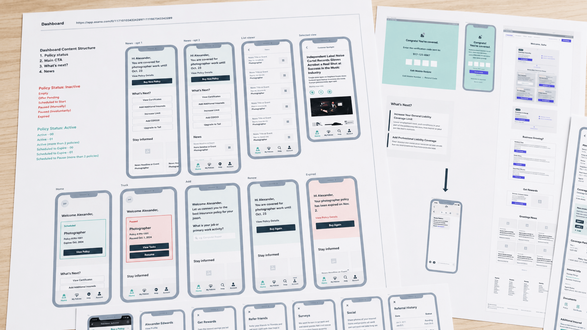
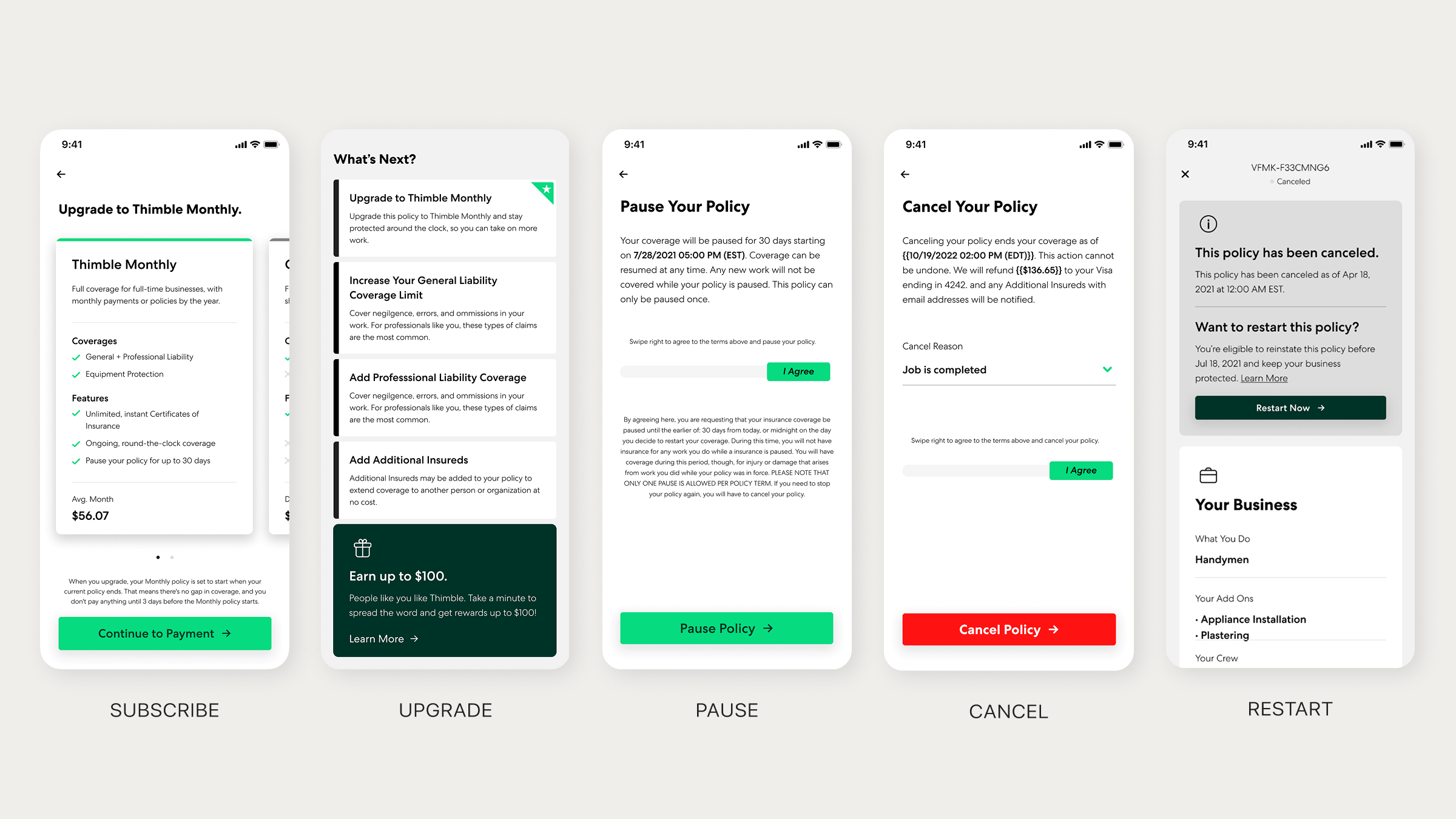
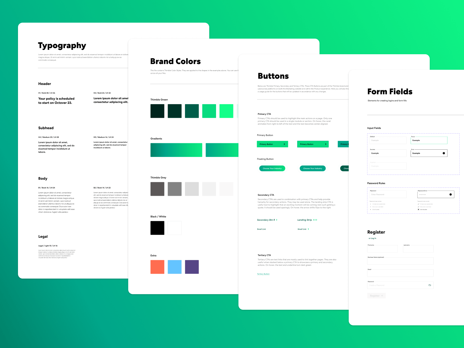
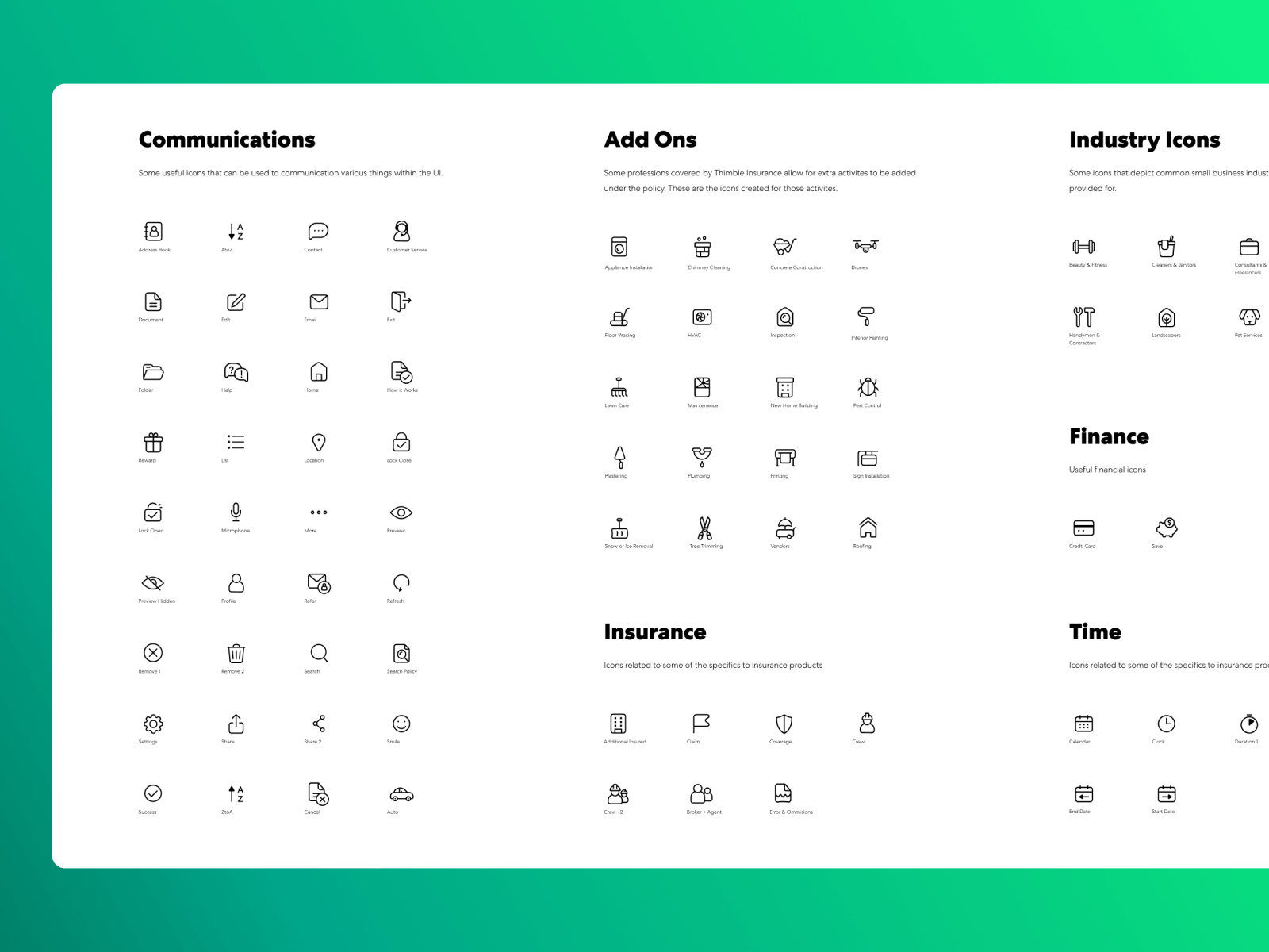
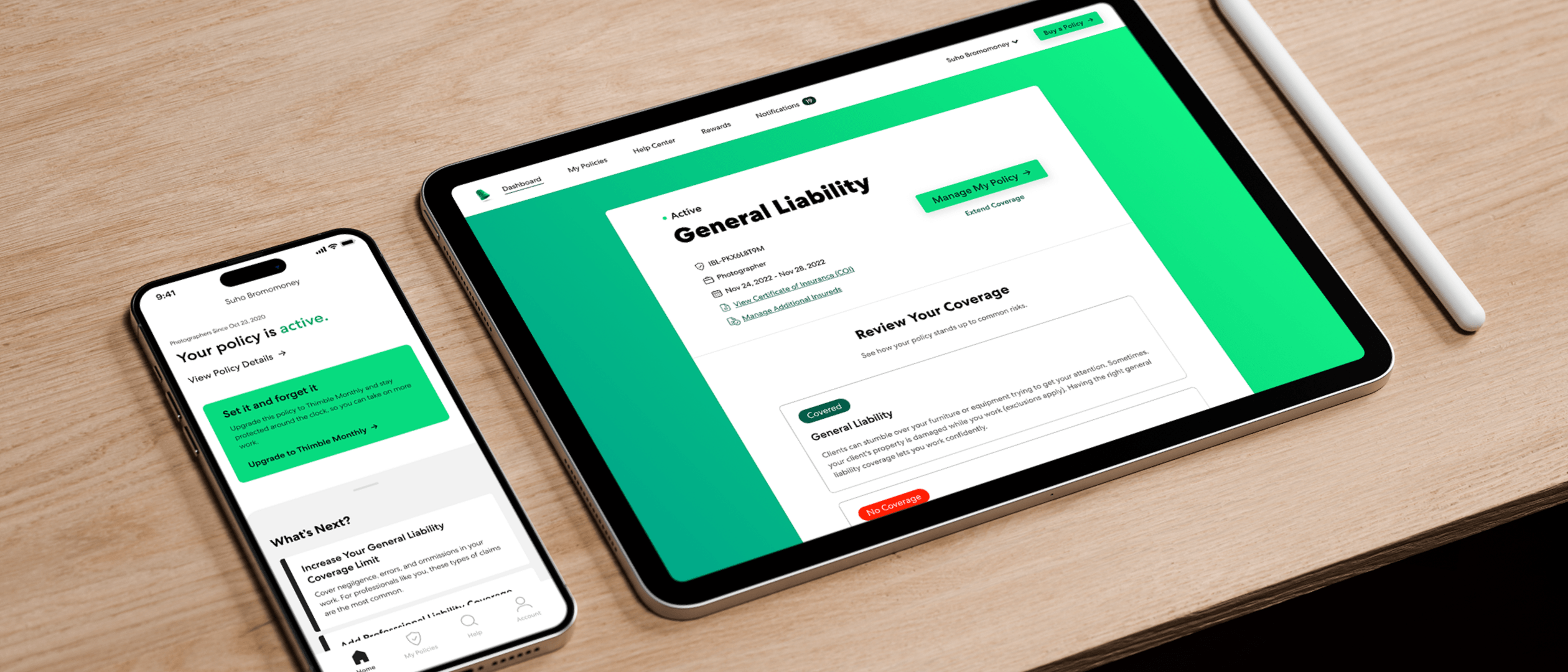
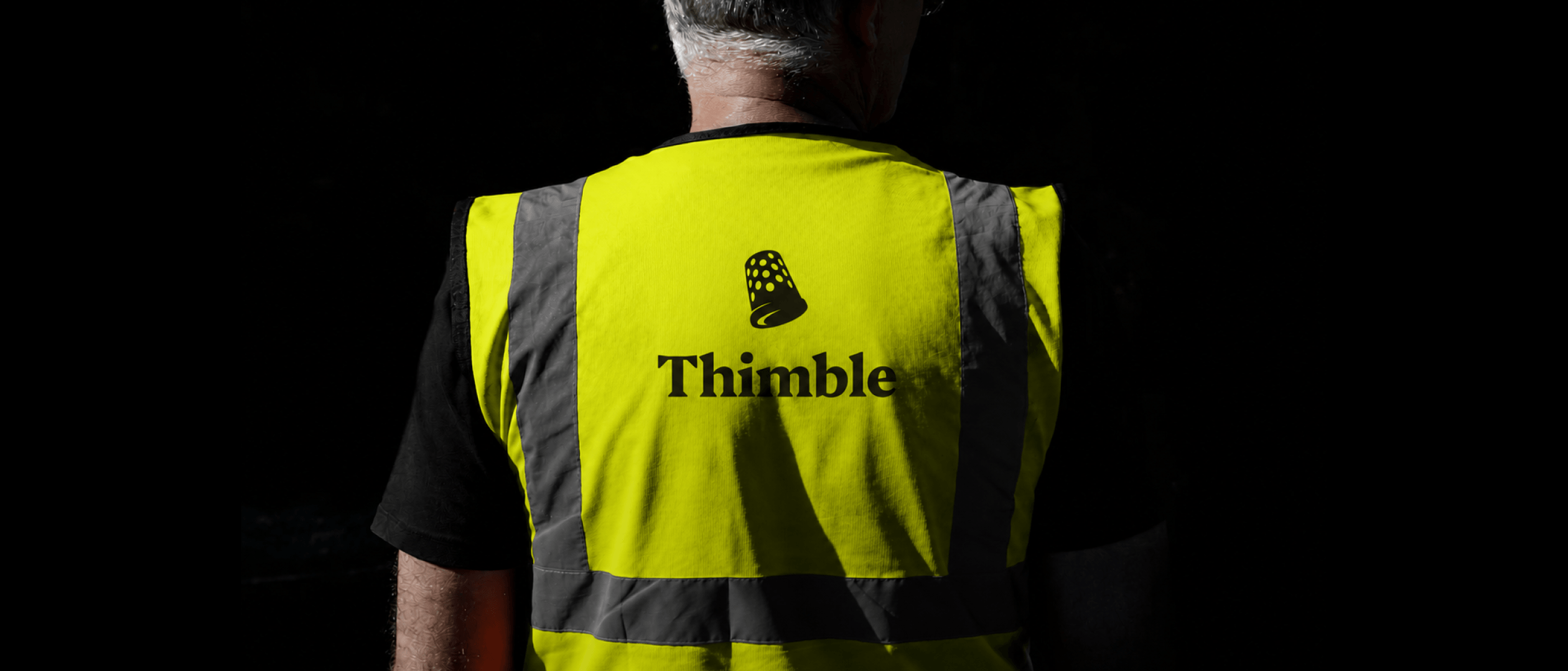
Building Thimblefrom 0→1
 thimble-2/thumb.png · 4:5
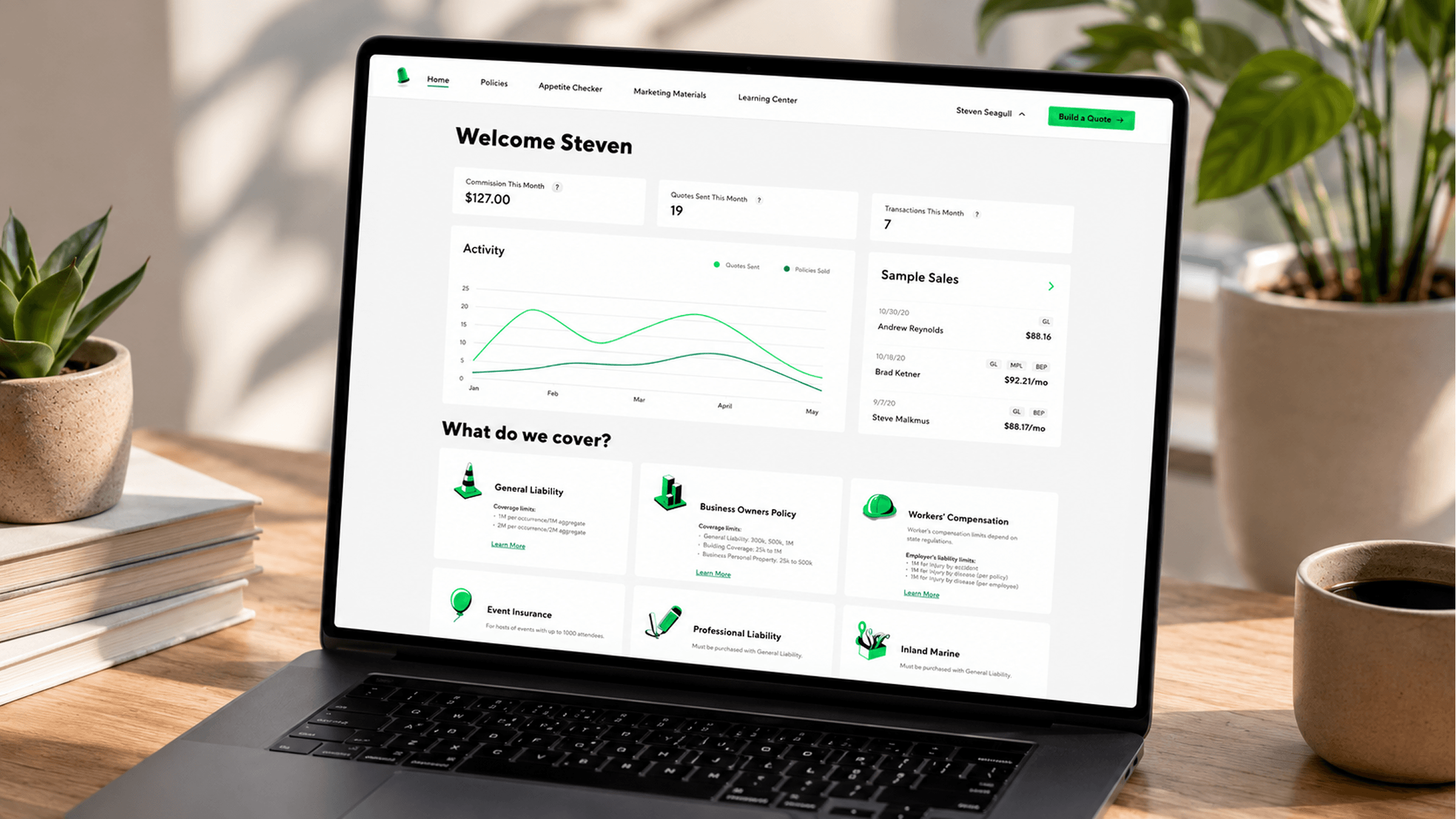
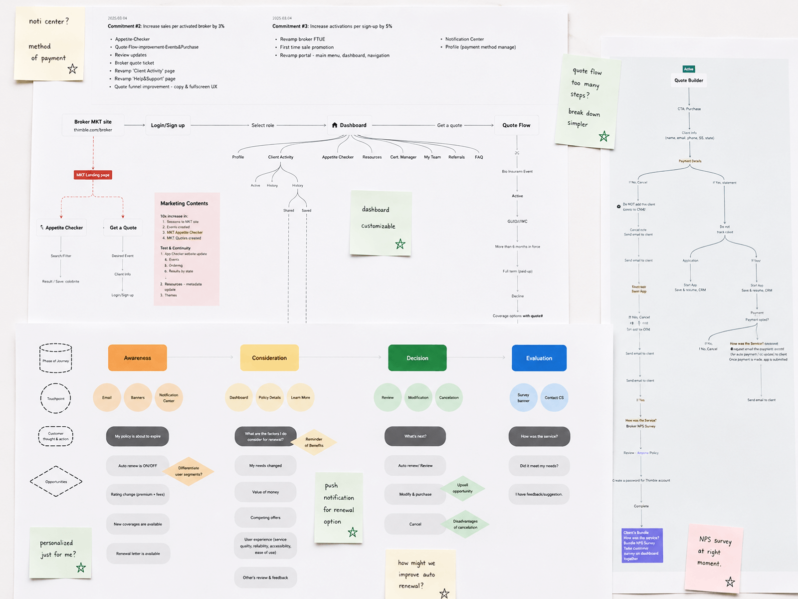
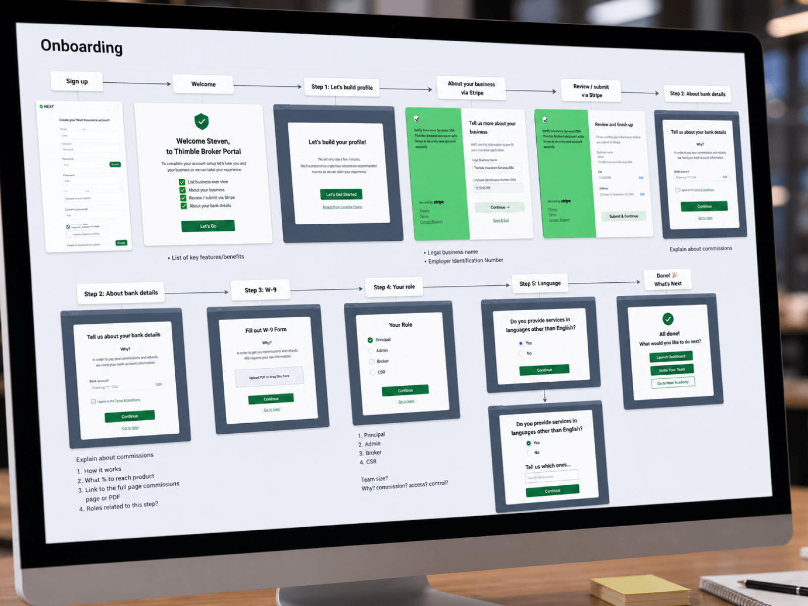
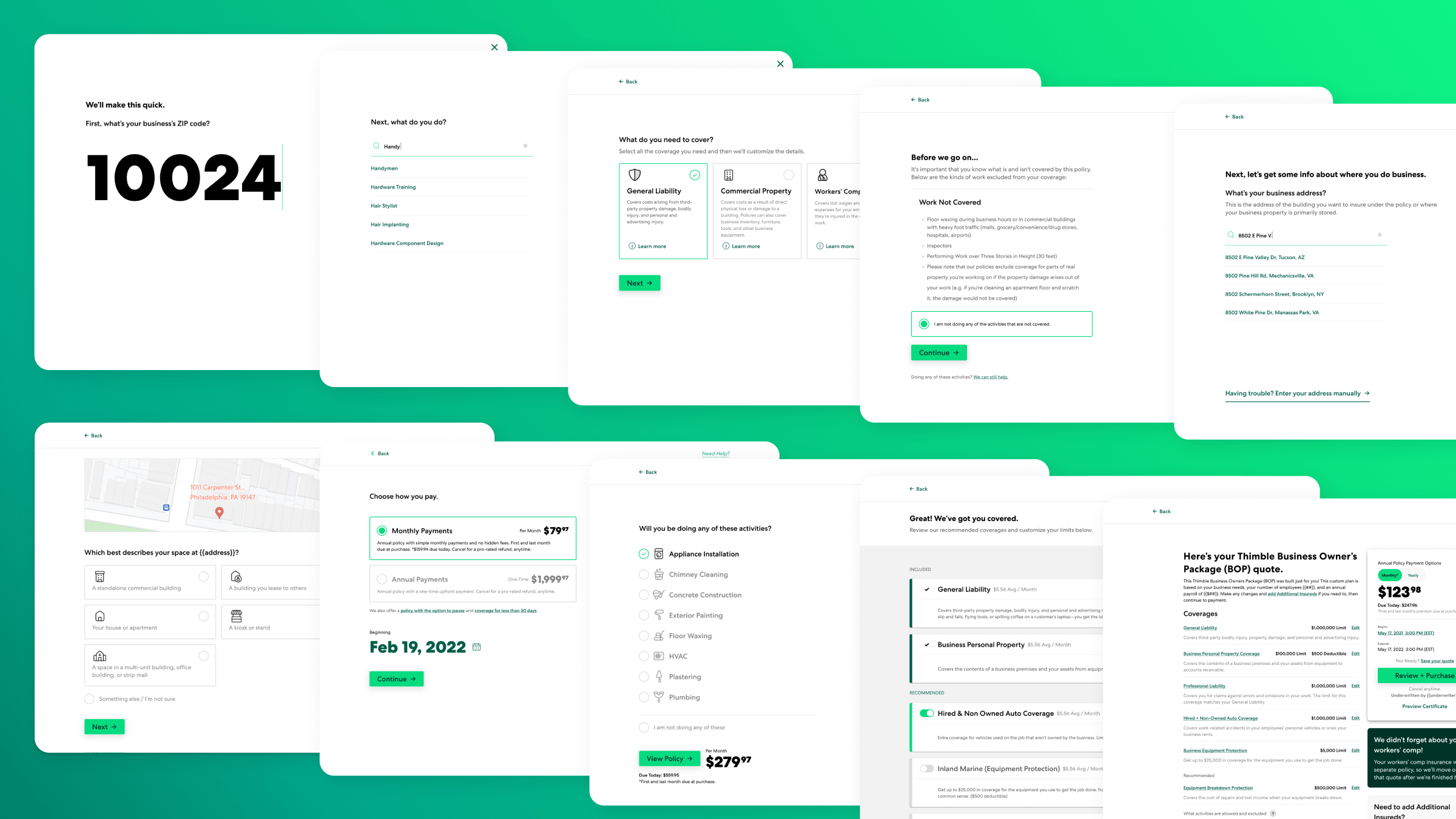
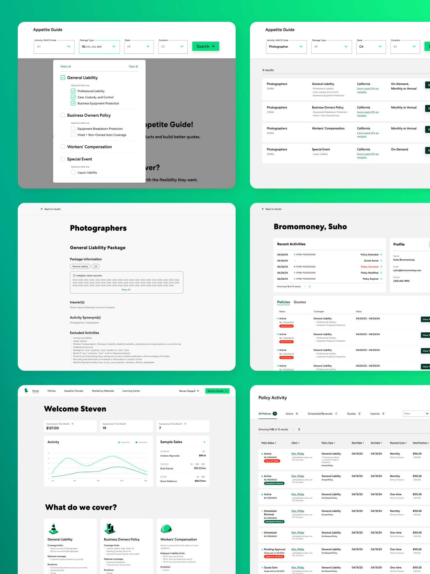
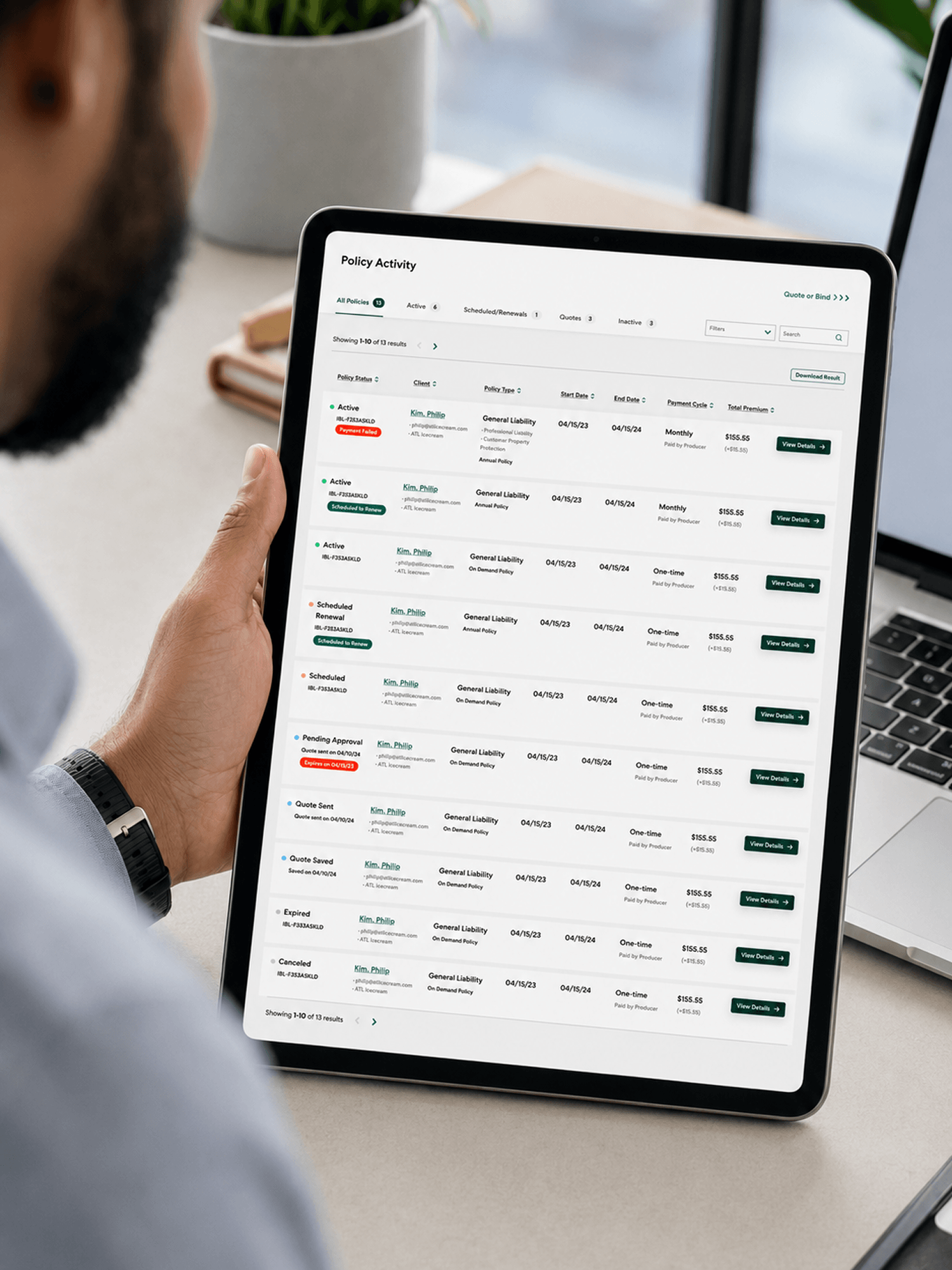
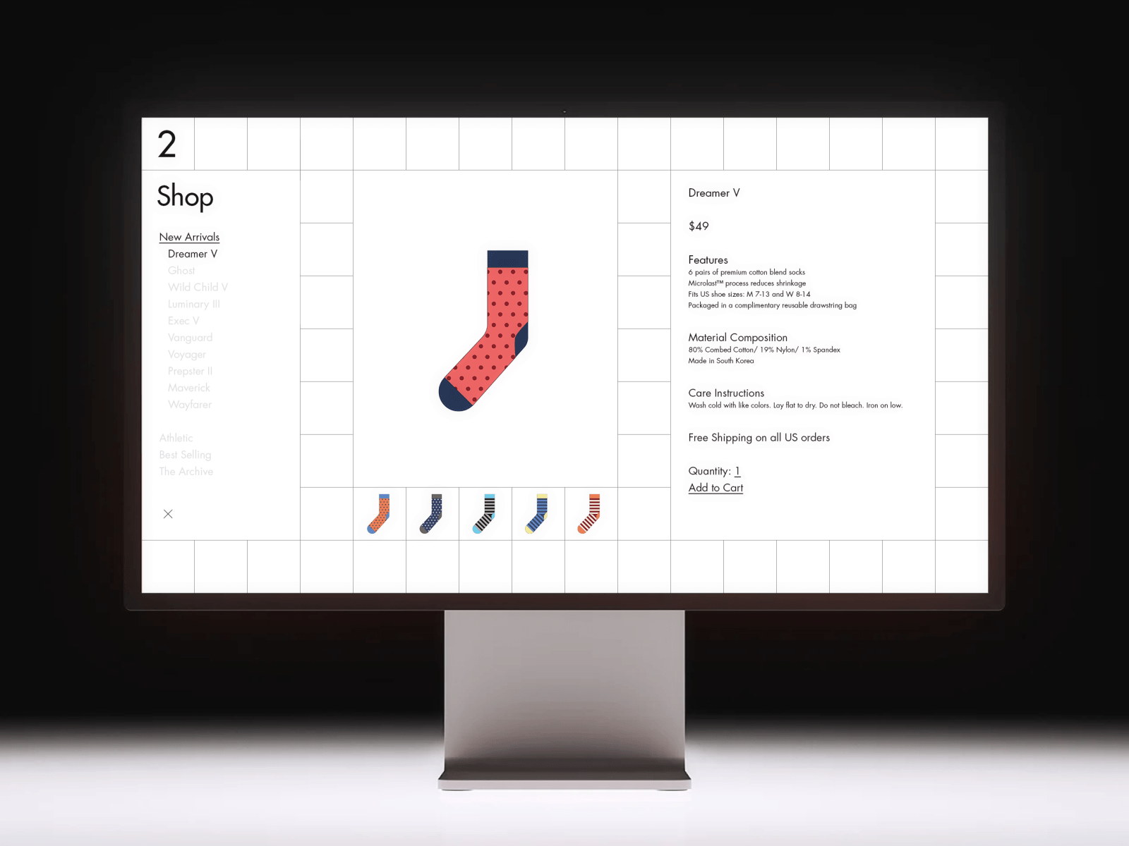
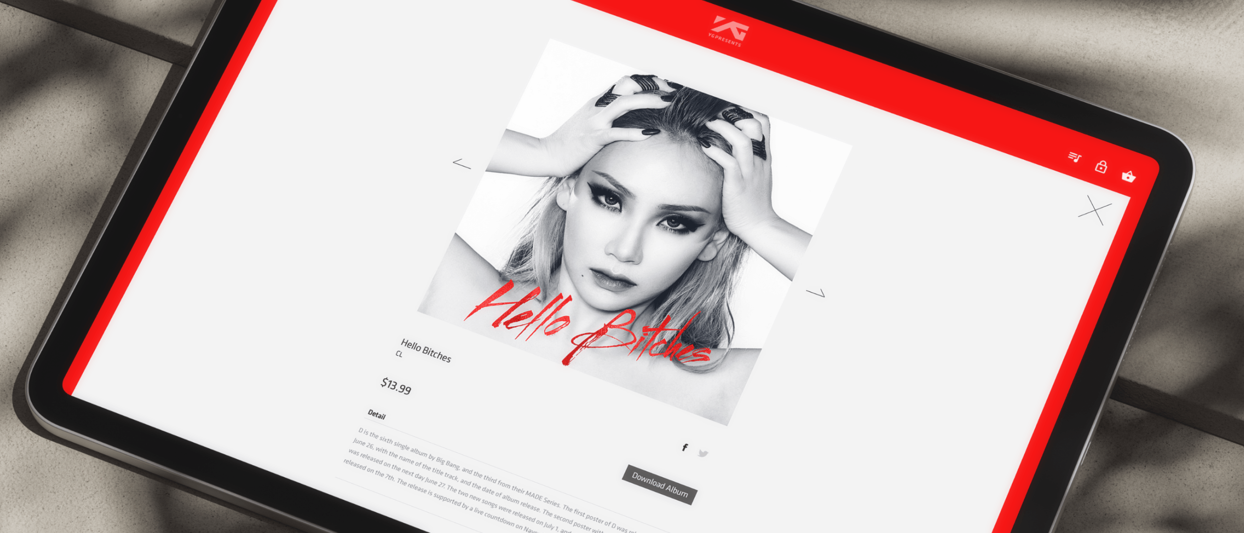
Thimble for BrokersD2B2C platform
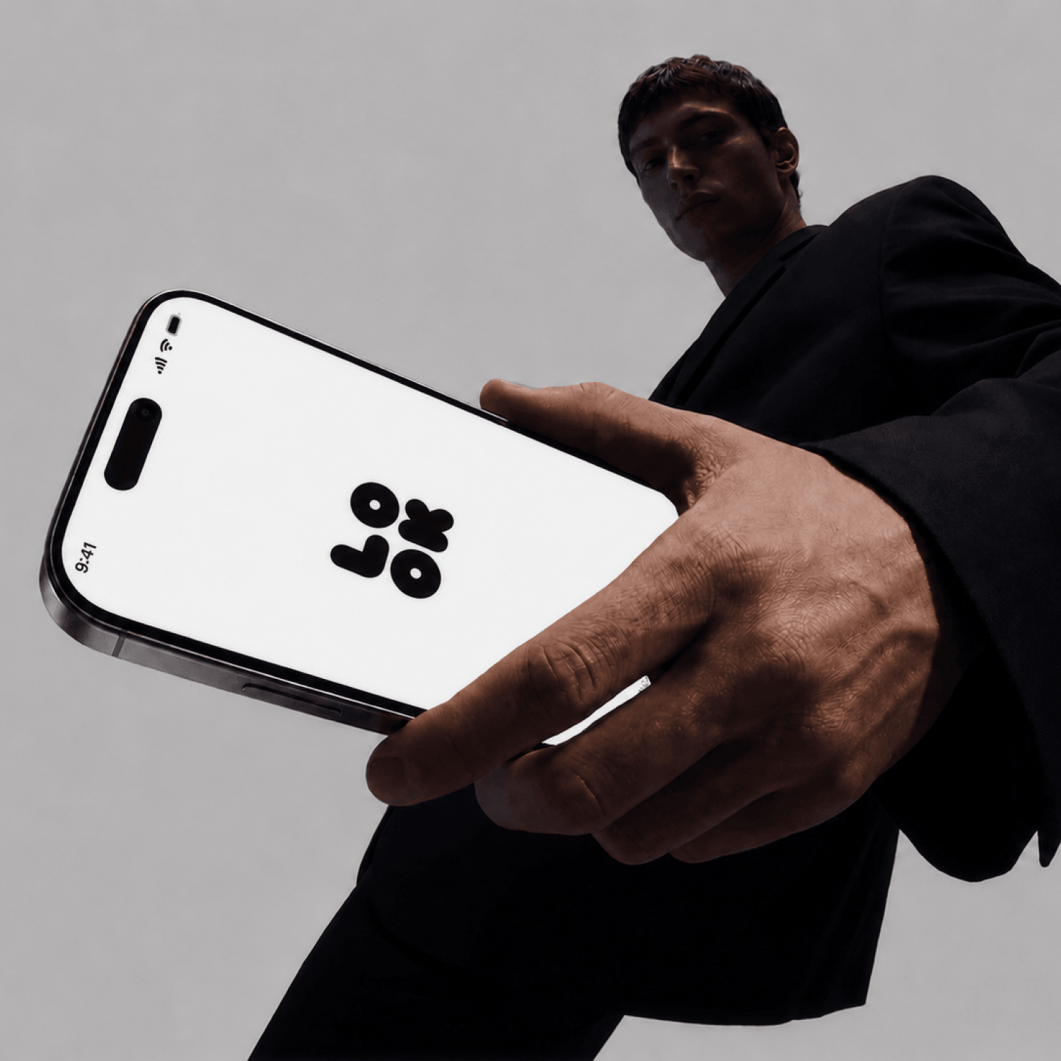 lookscope/thumb.png · 1:1
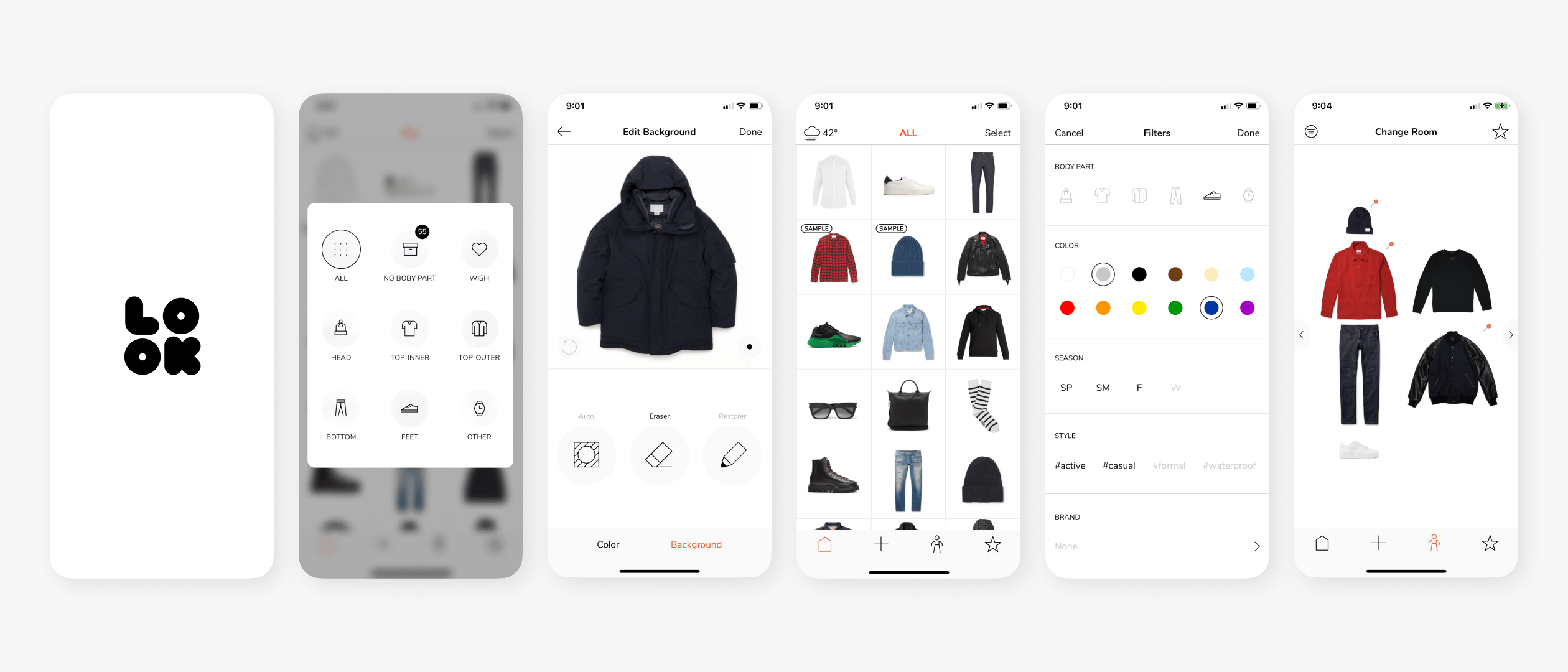
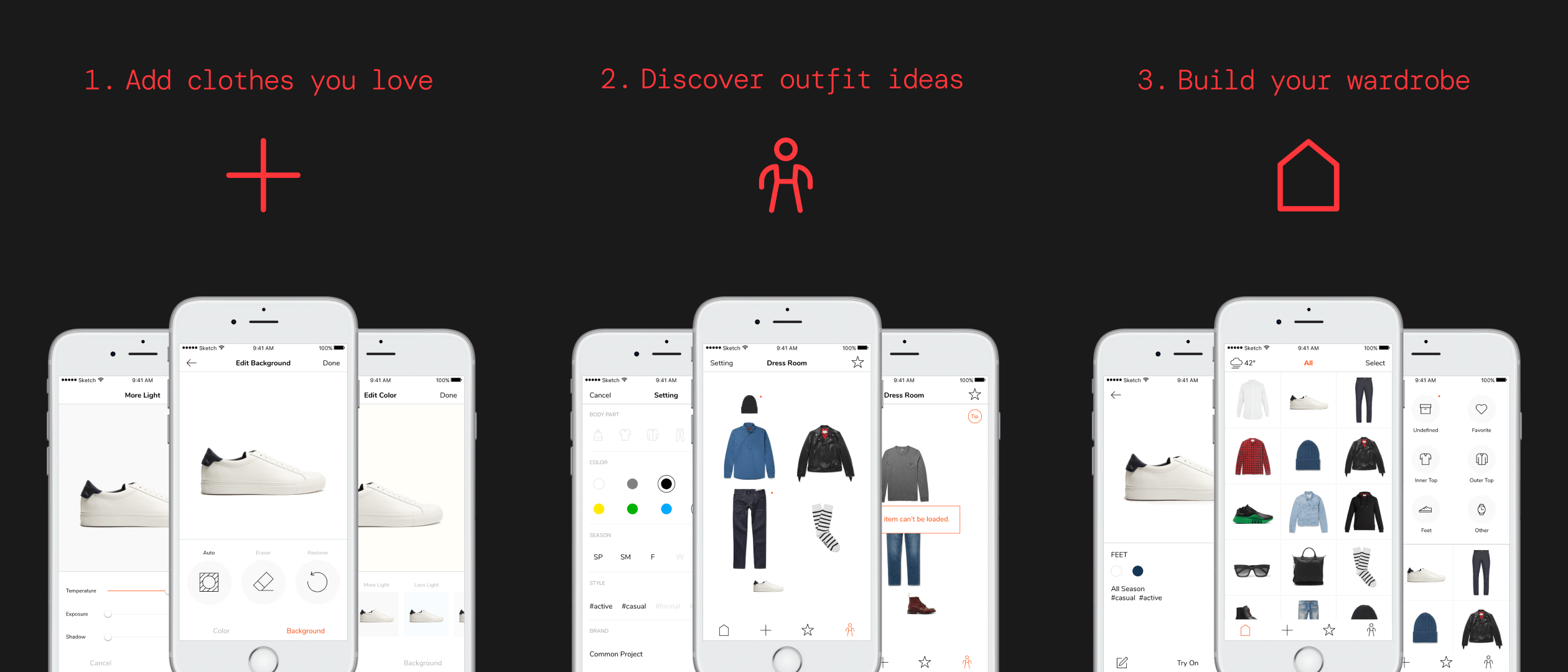
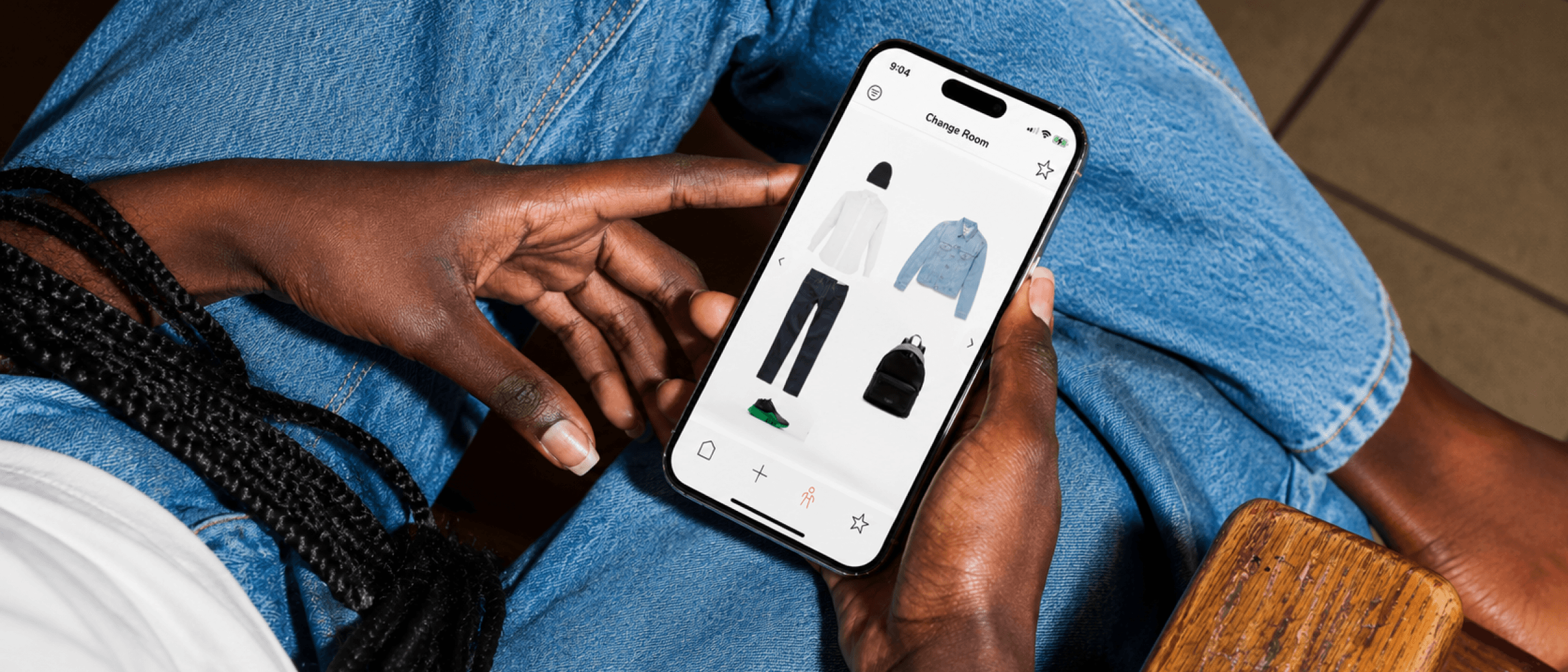
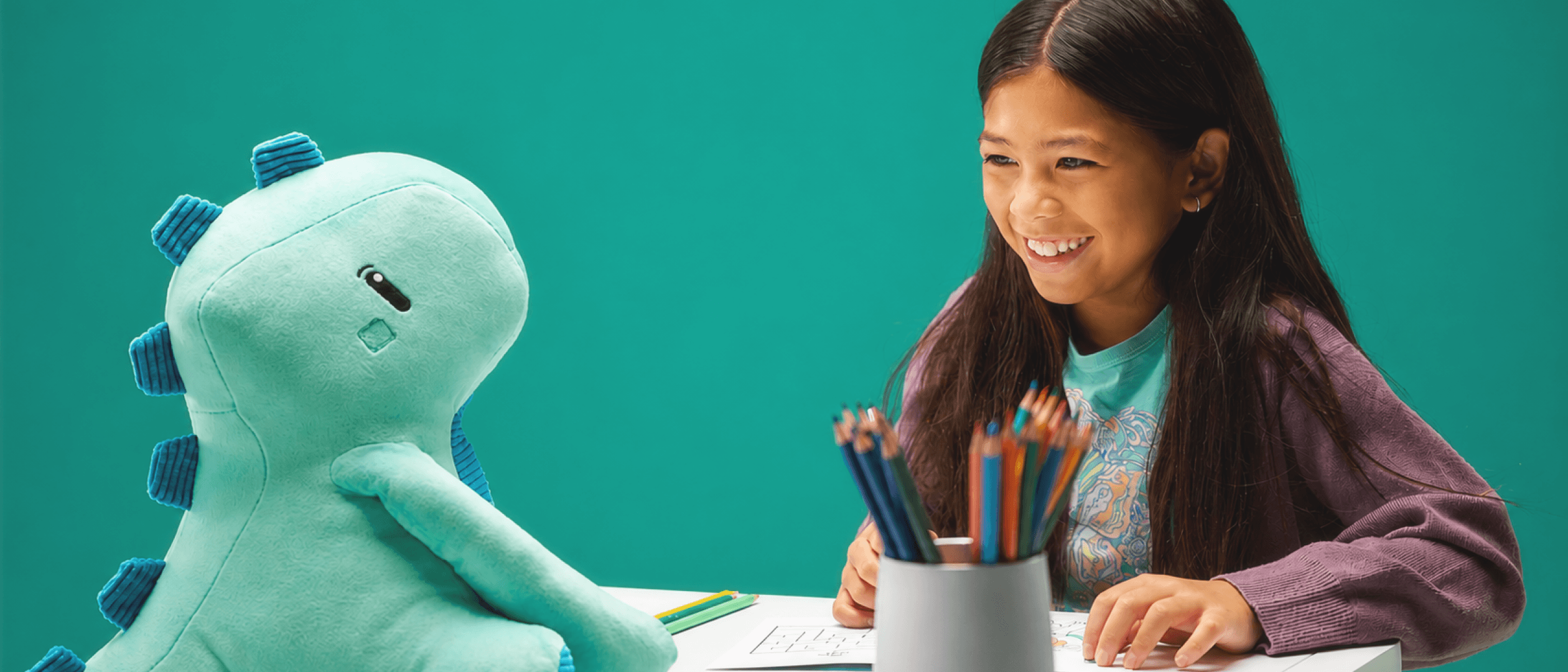
Lookscope
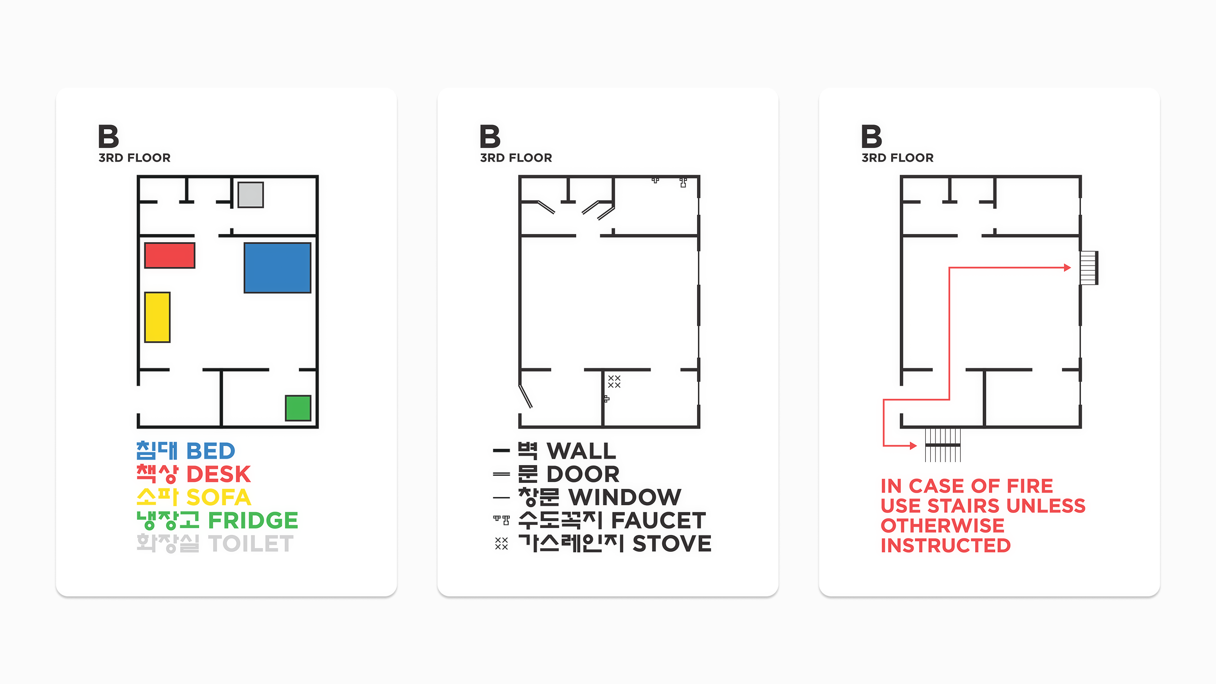
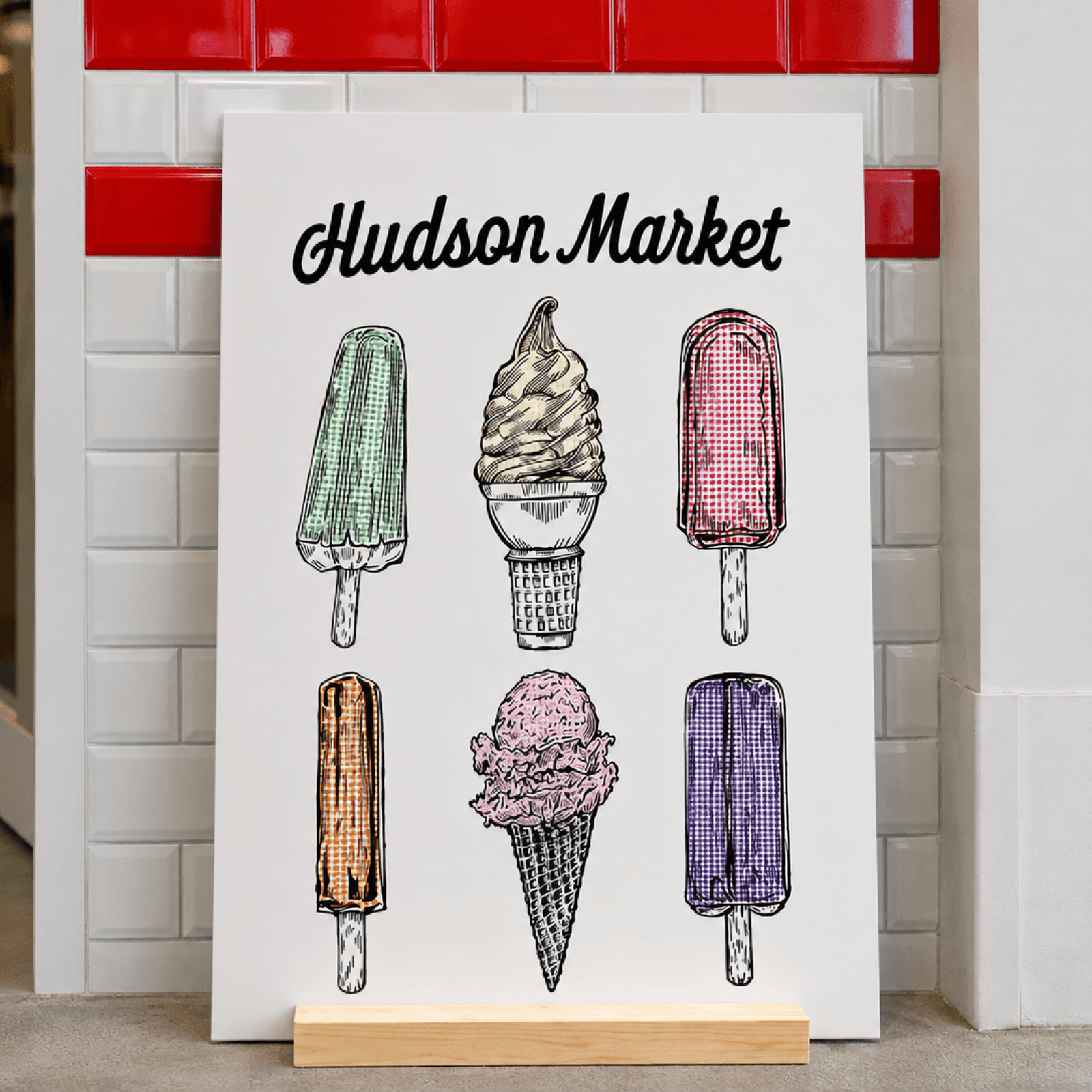 hudson/thumb.png · 1:1
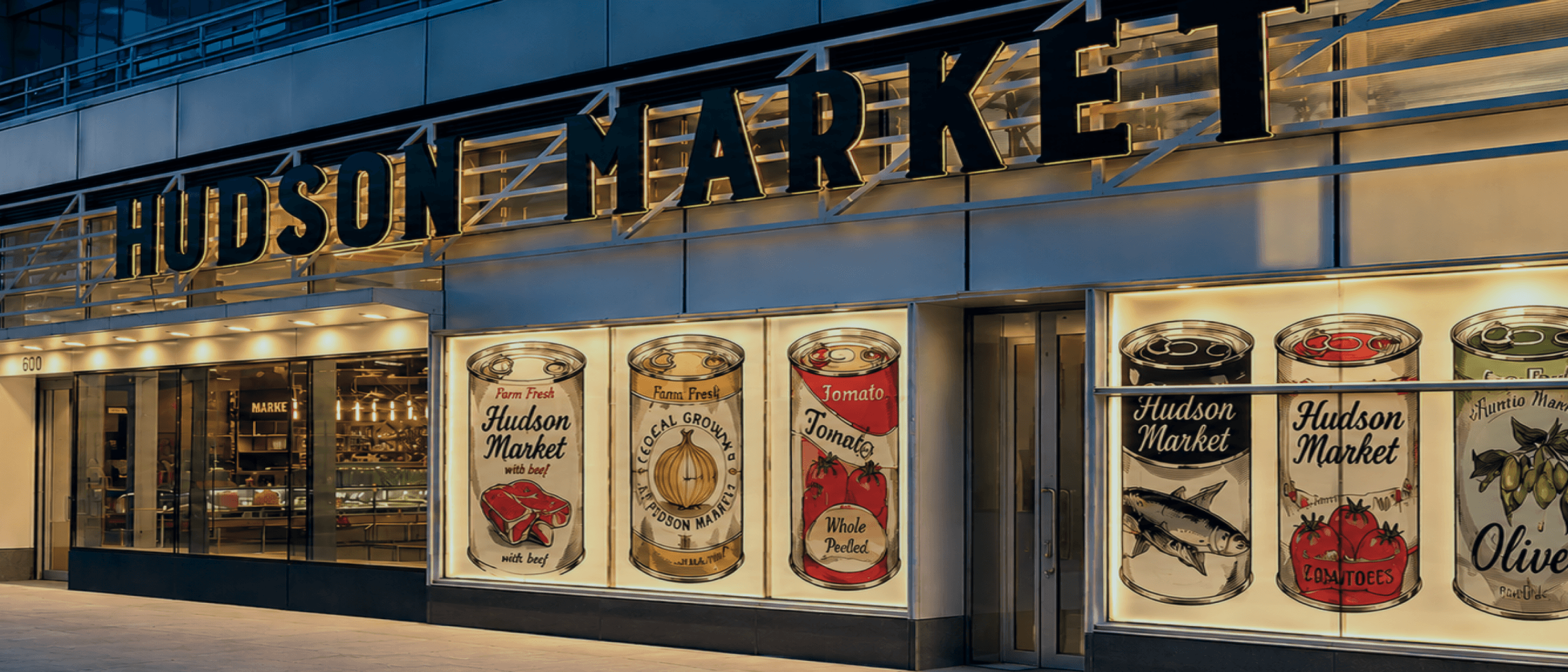
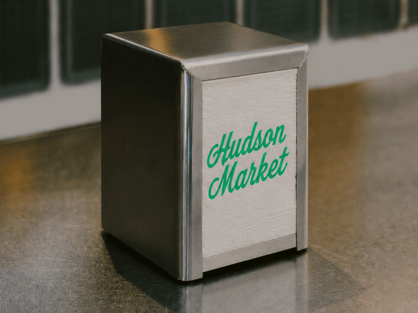
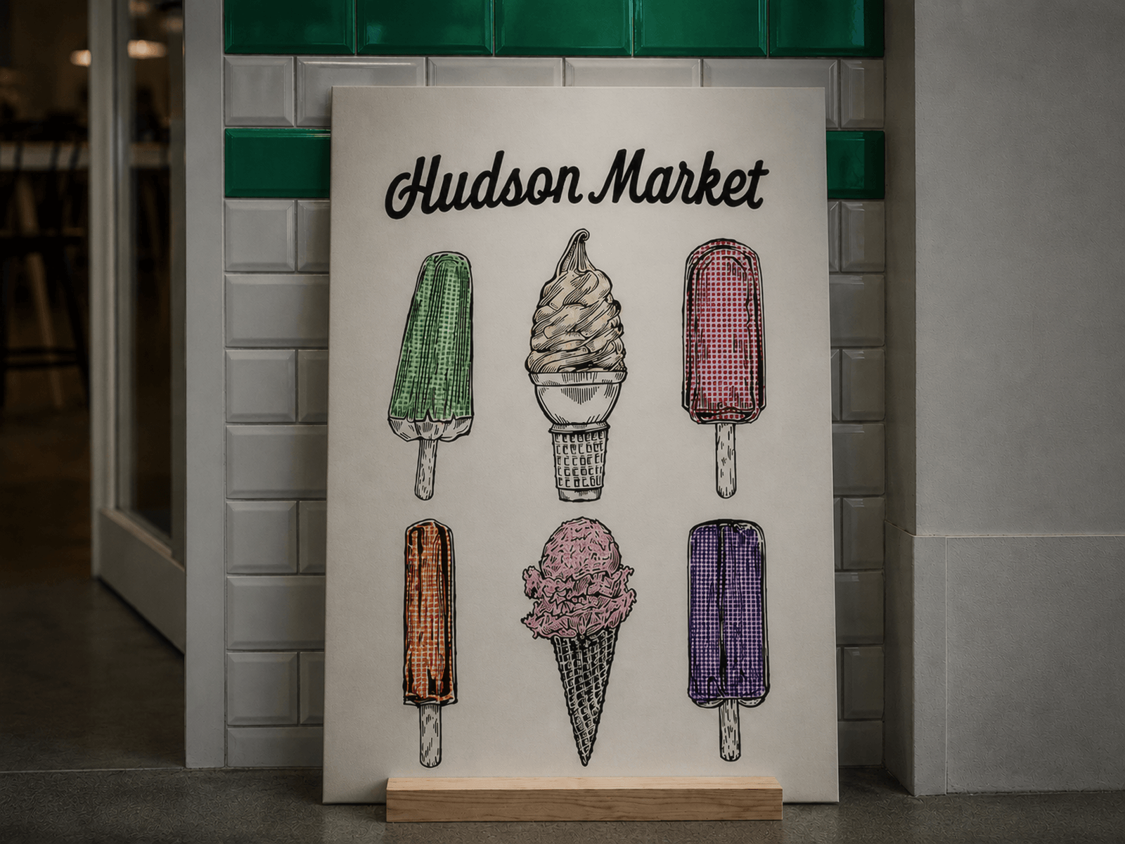
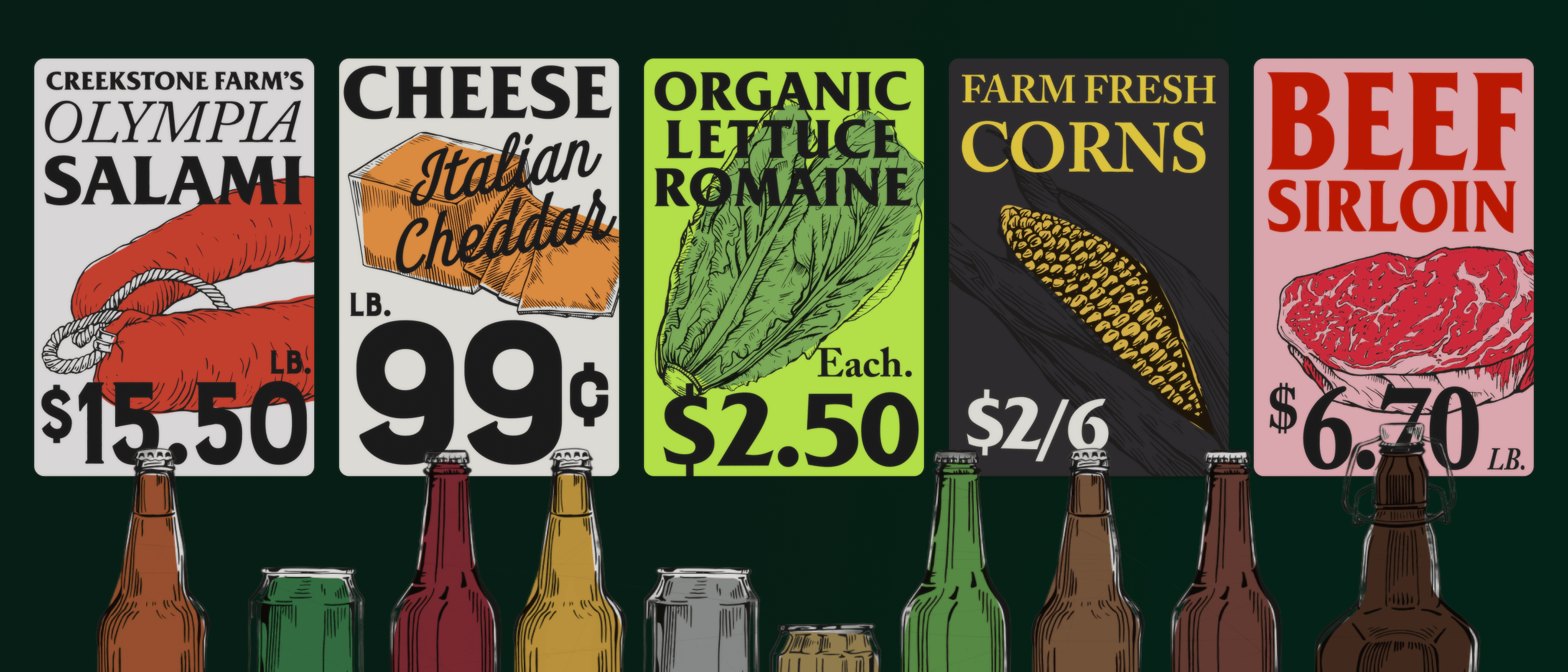
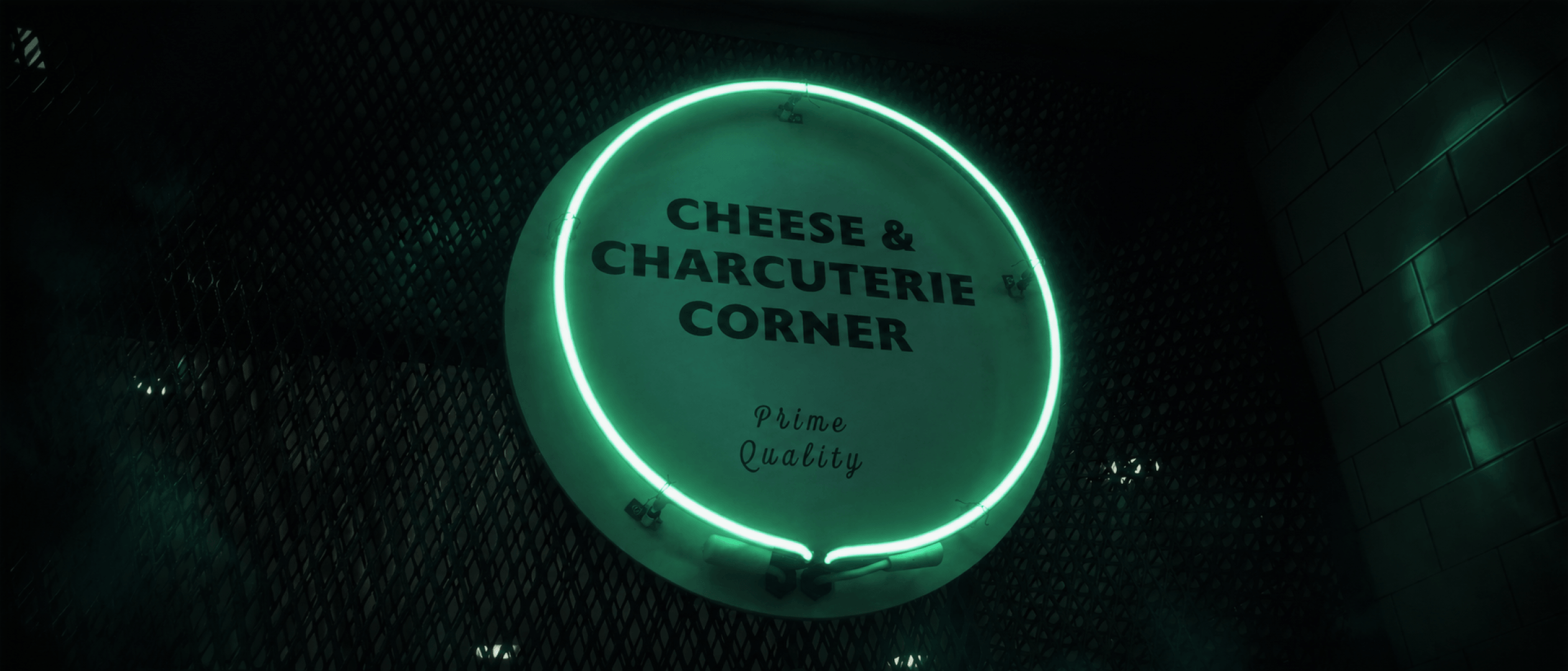
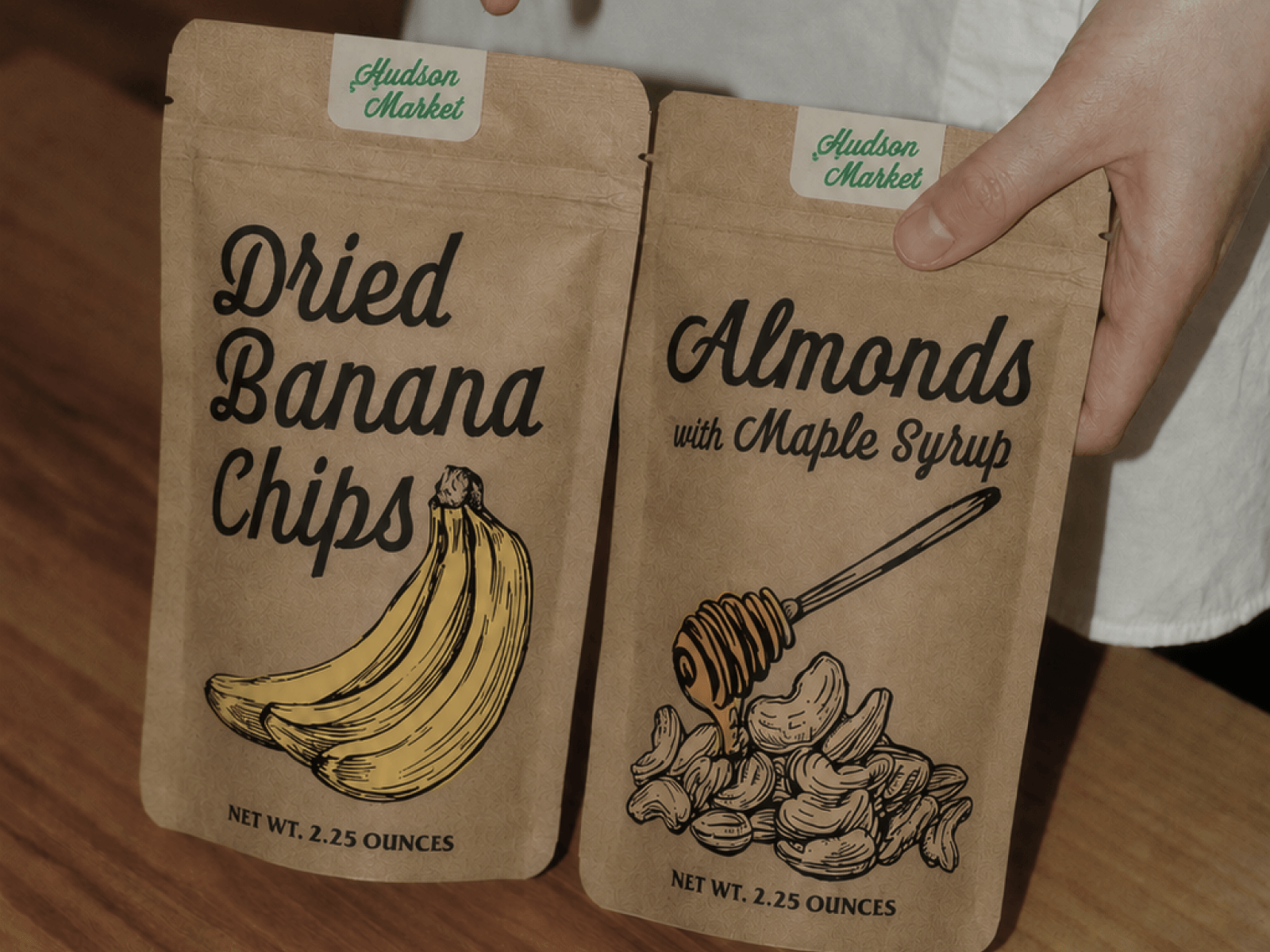
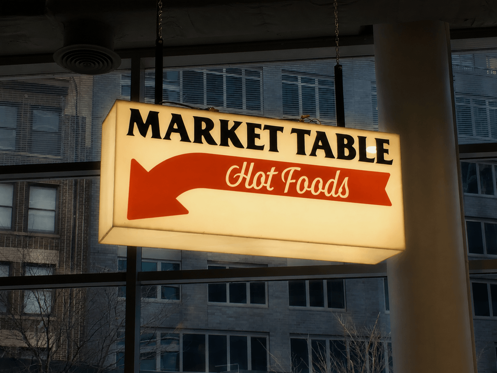
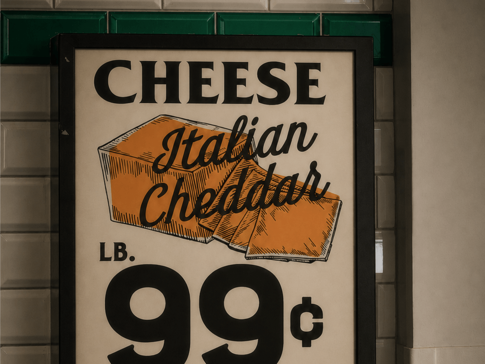
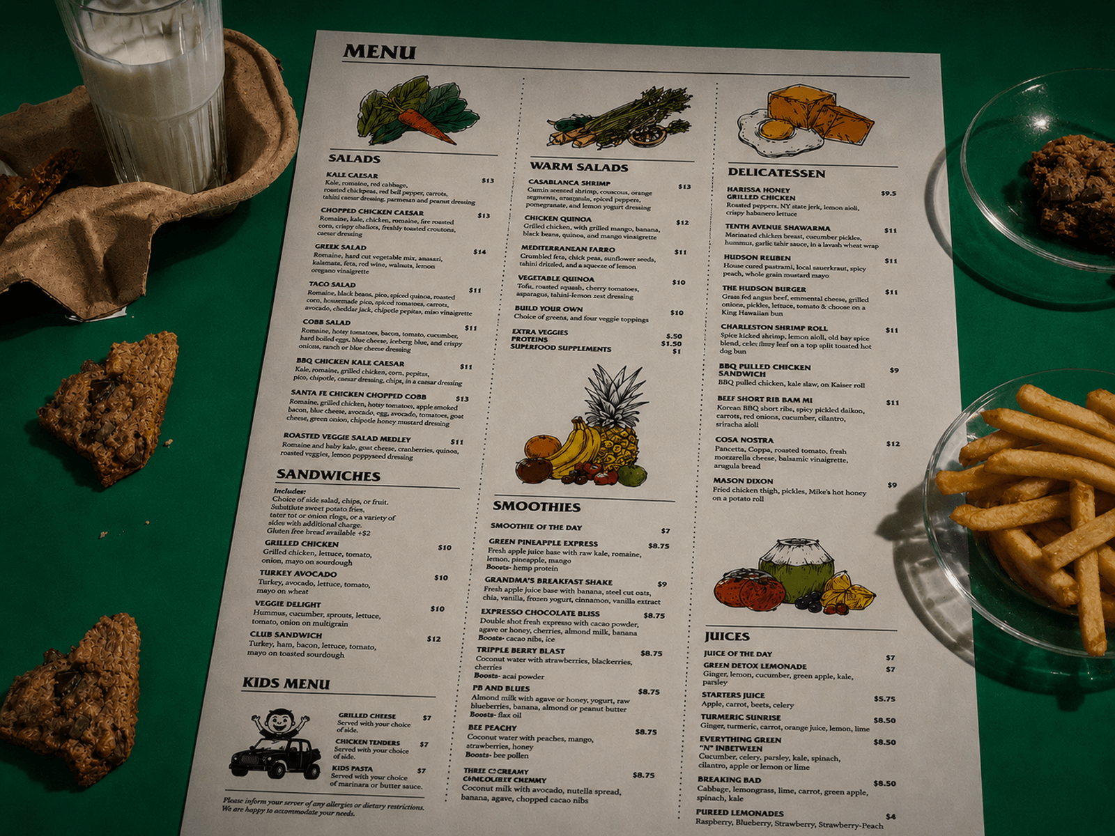
Hudson Market
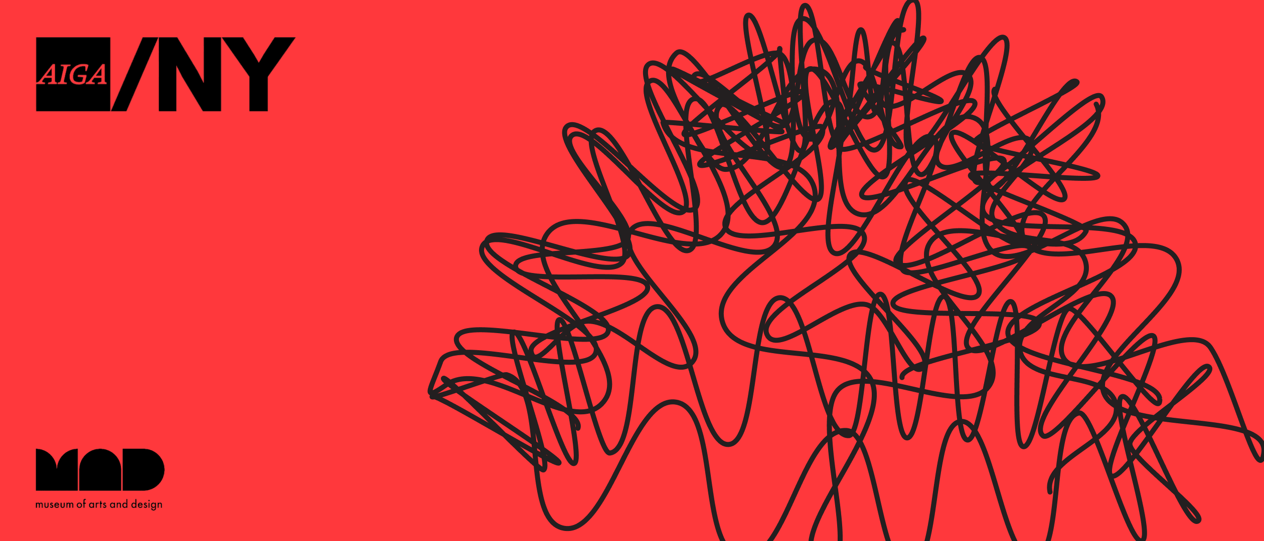
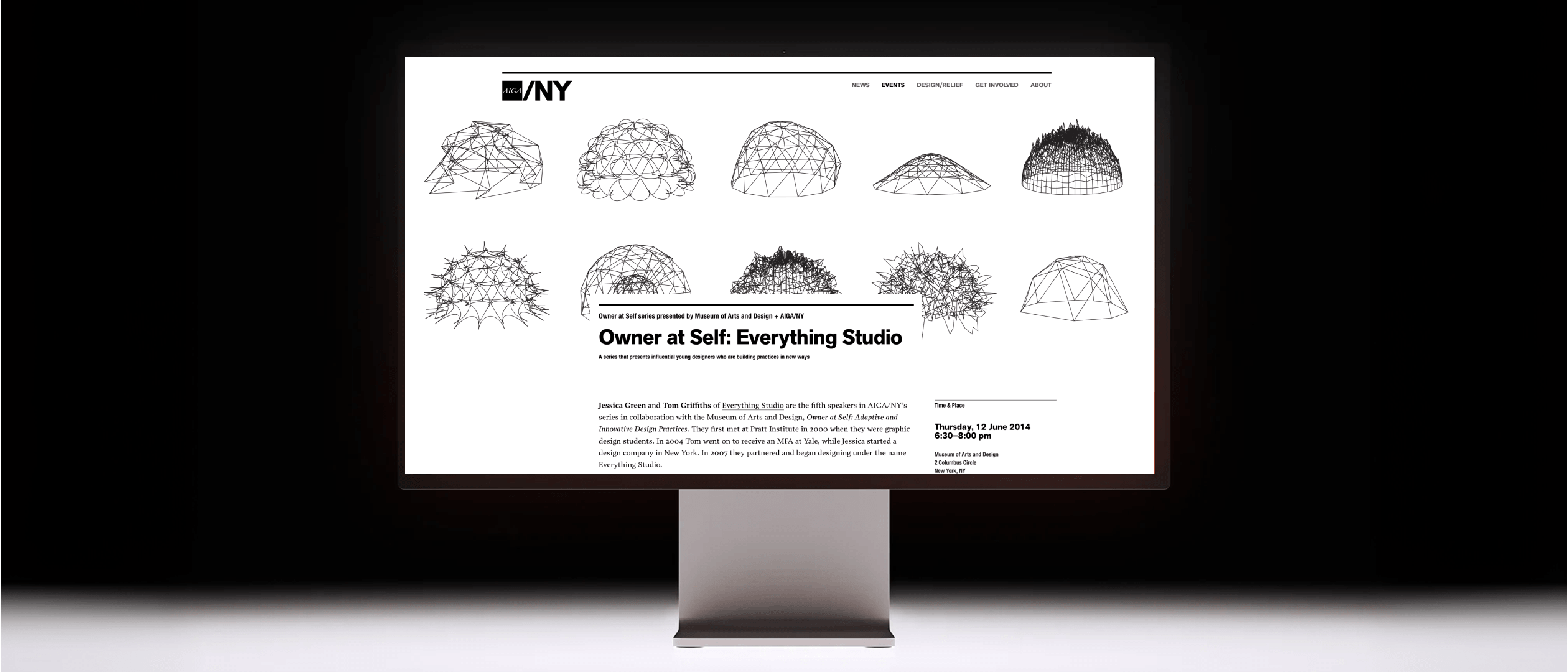
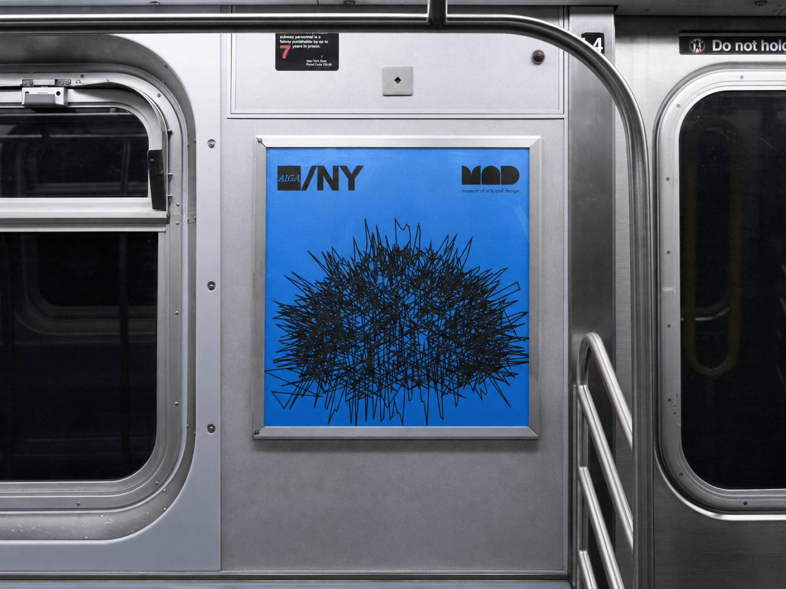
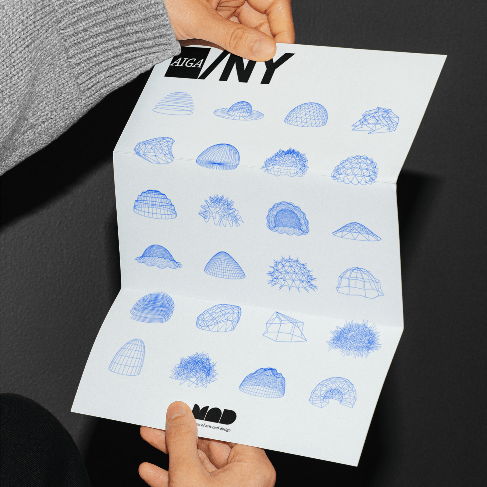
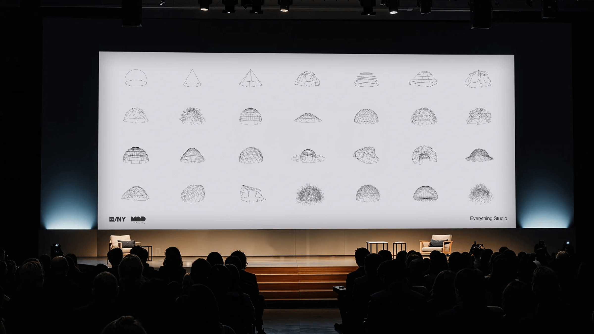
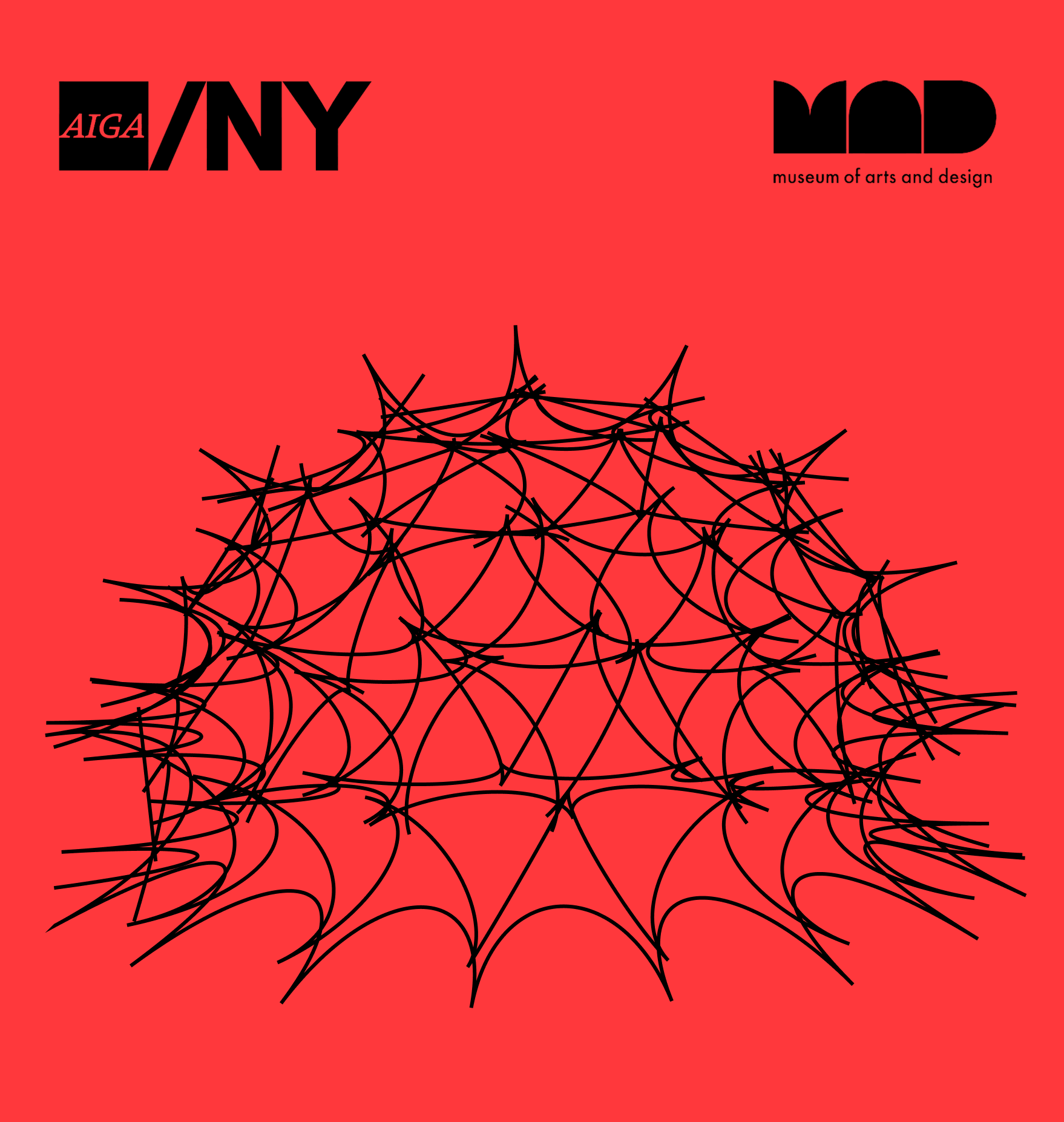 aiga/thumb.png · 1:1
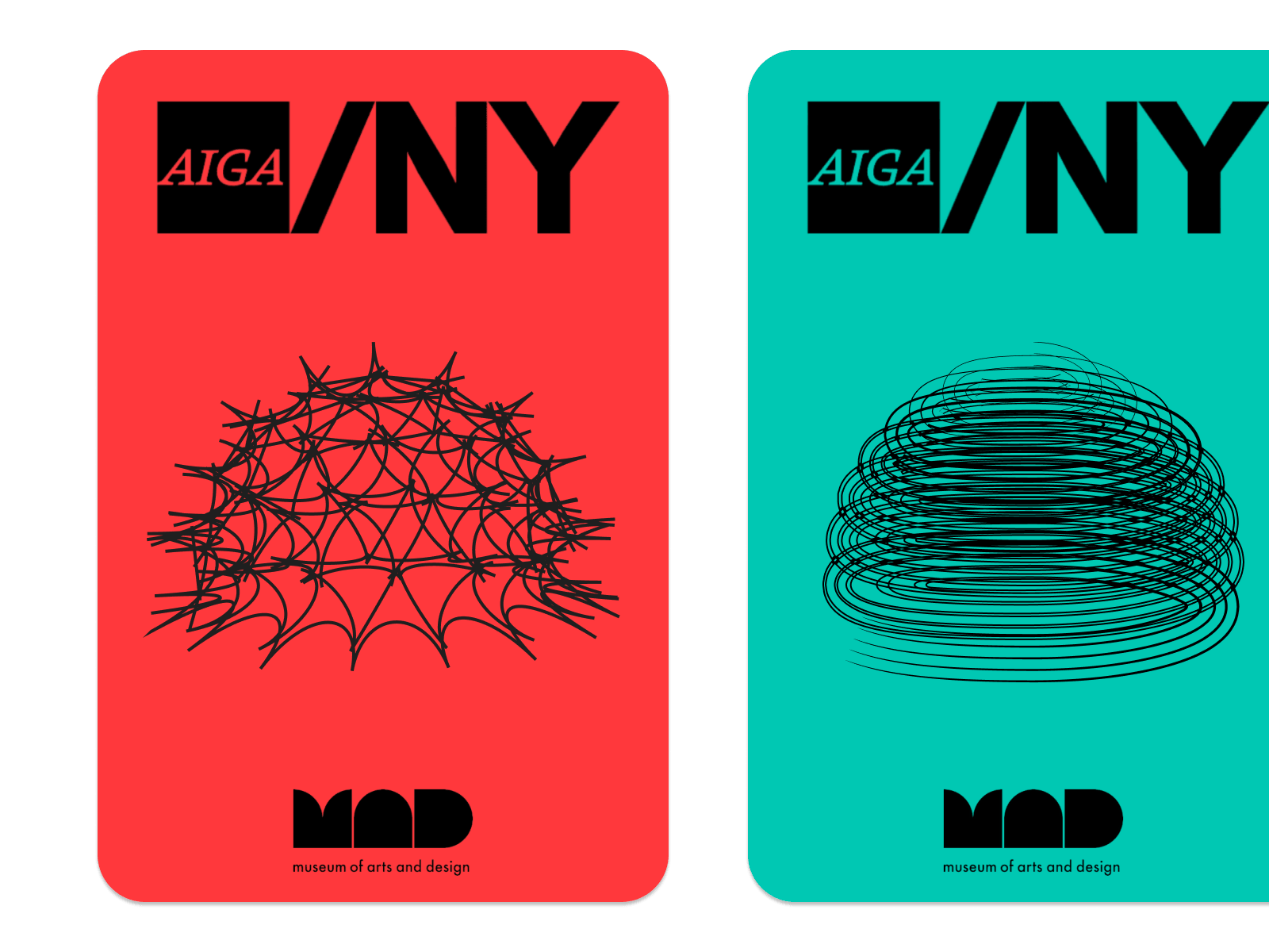
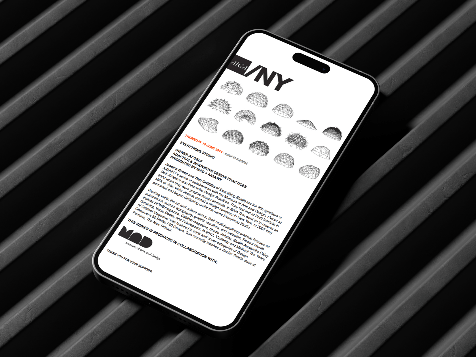
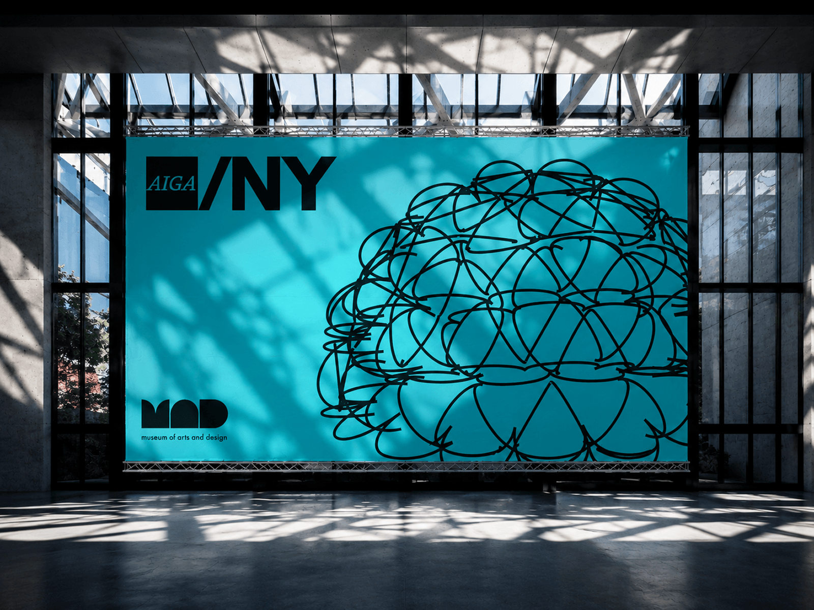
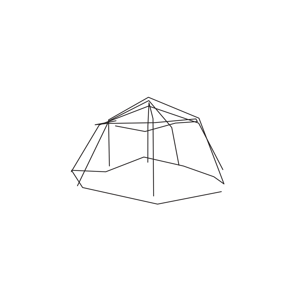
AIGA NY × MAD
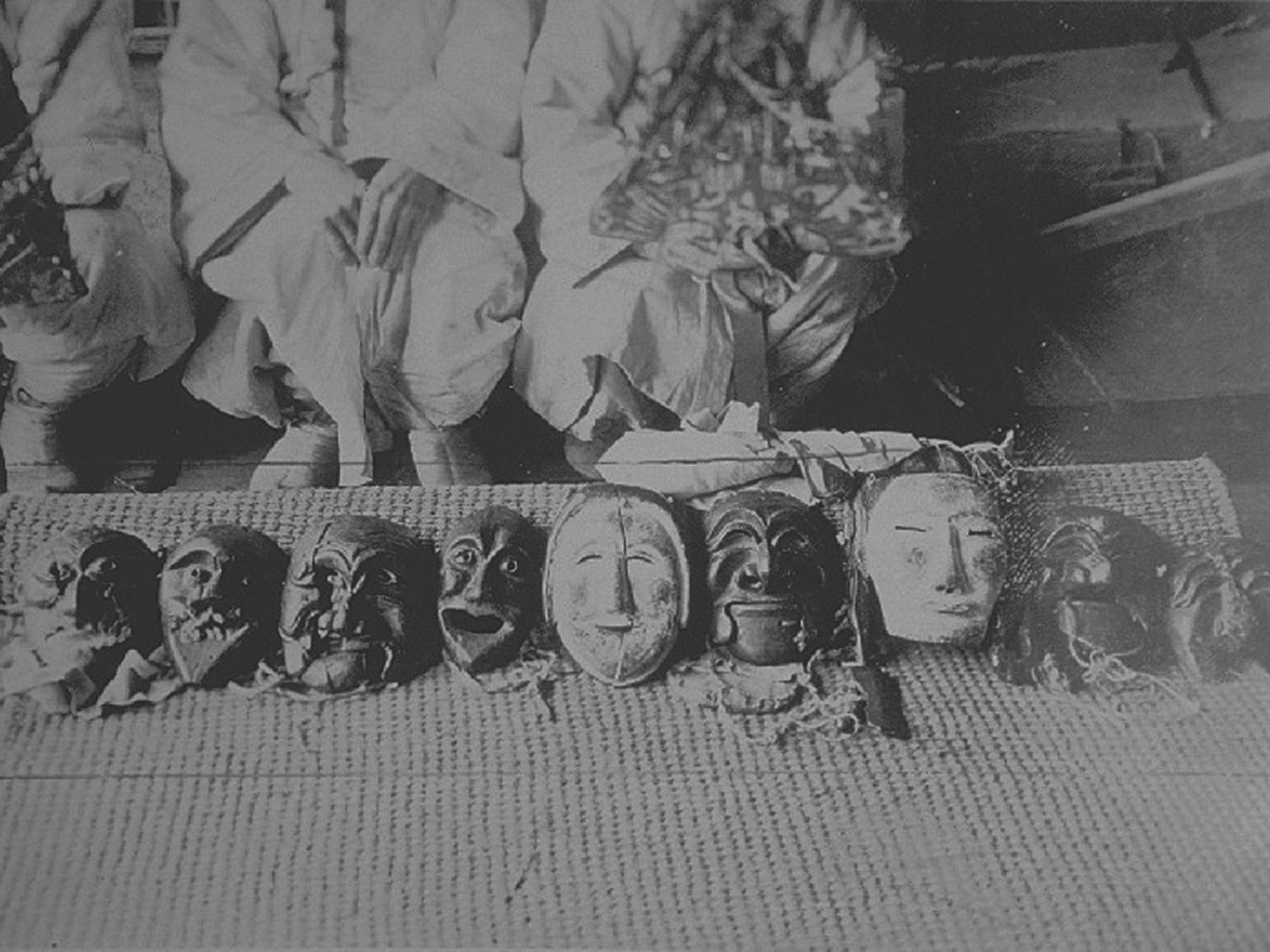
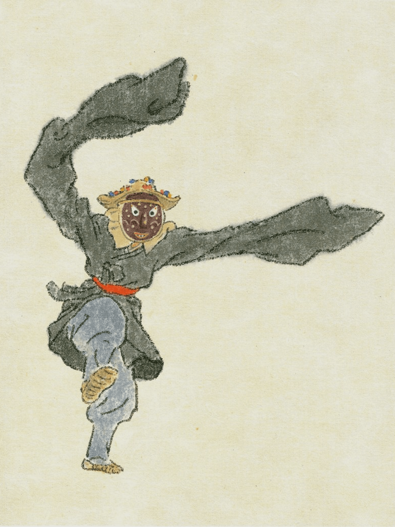
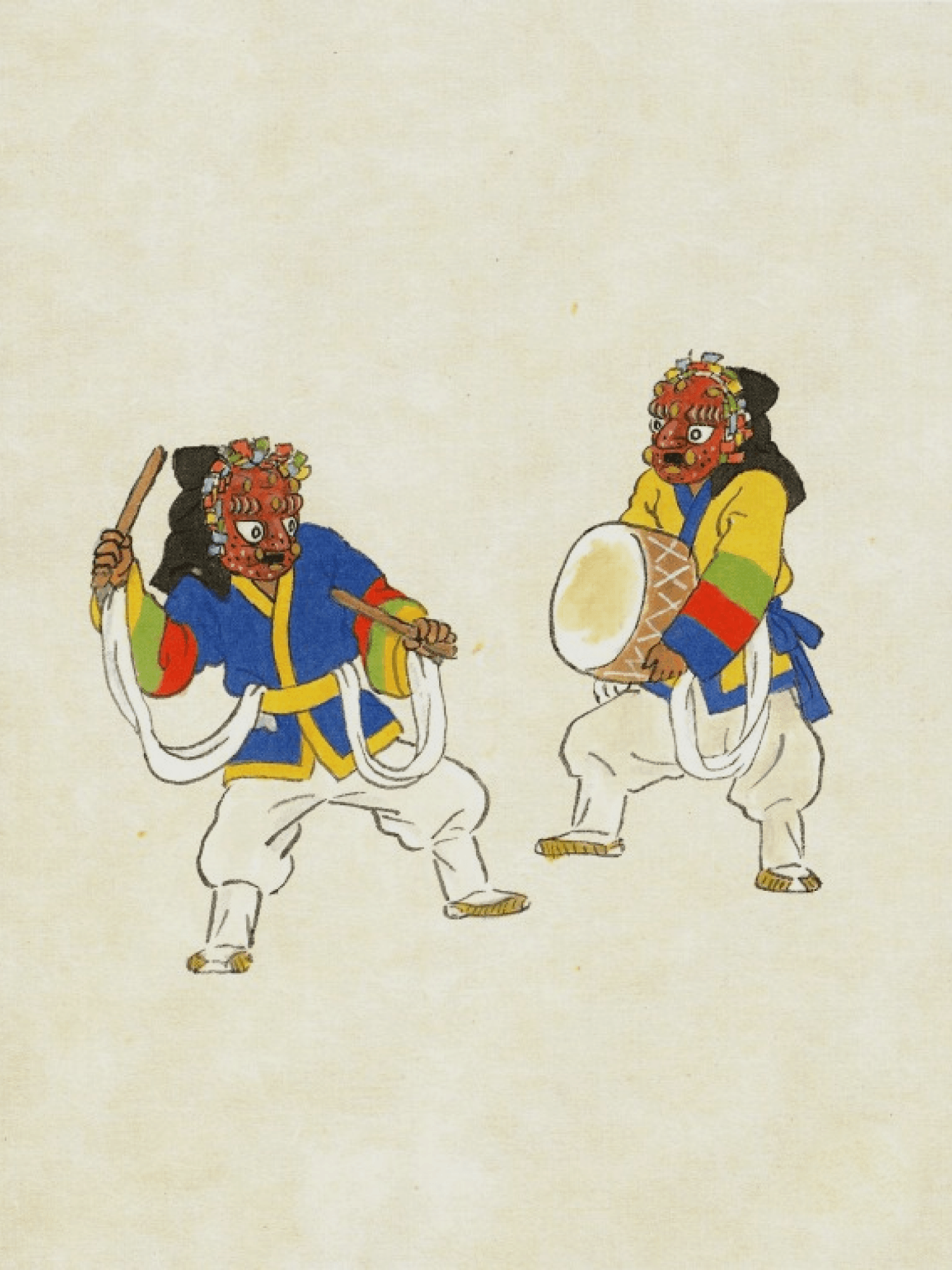
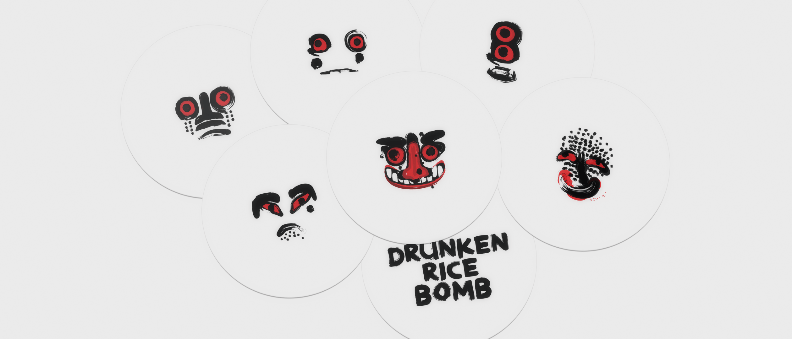
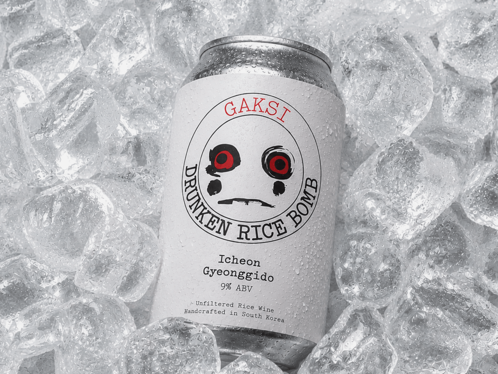
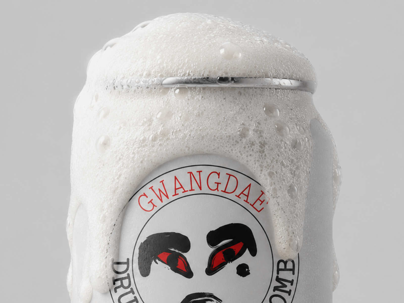
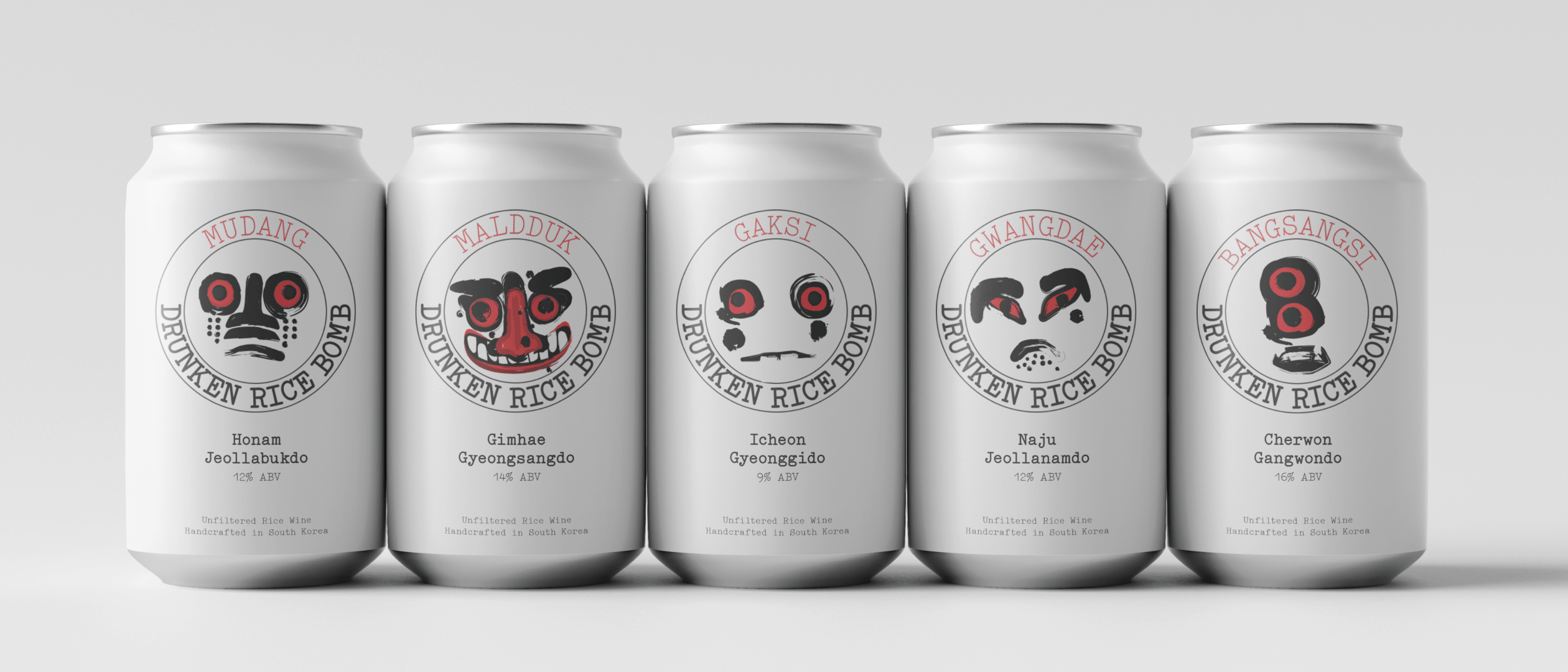
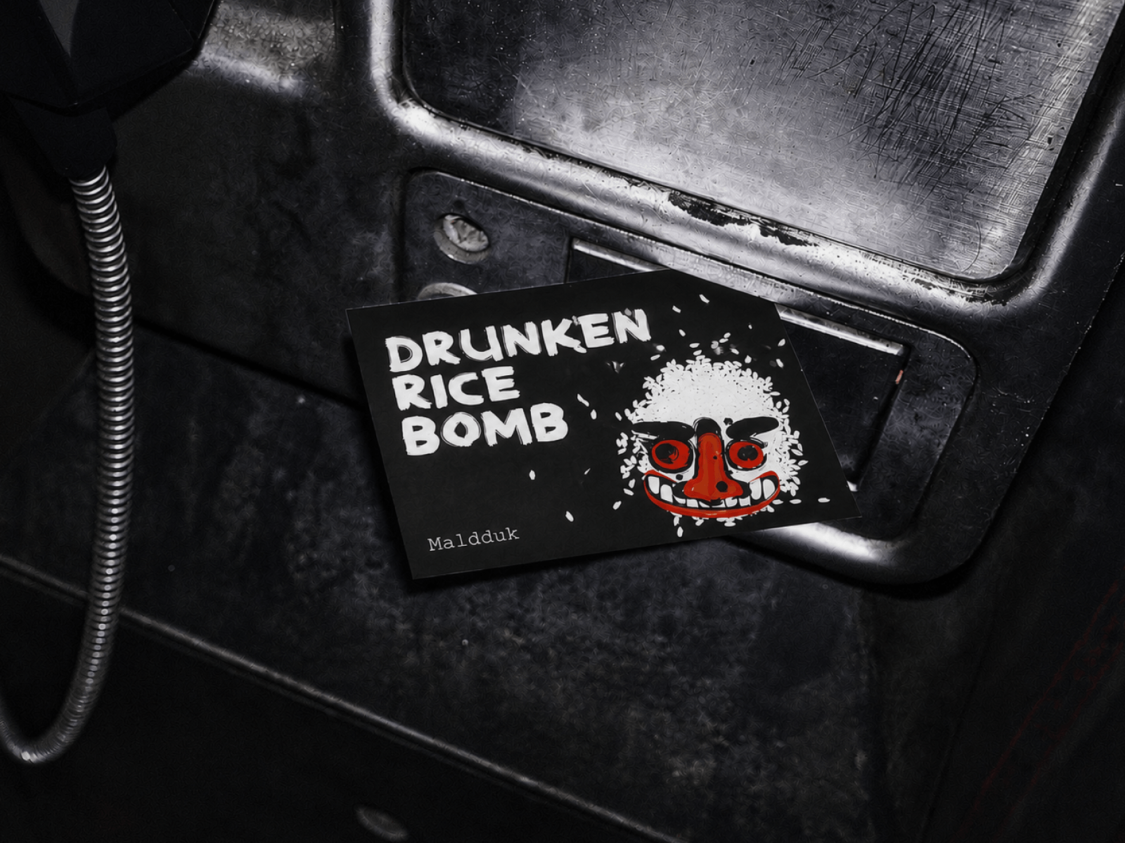
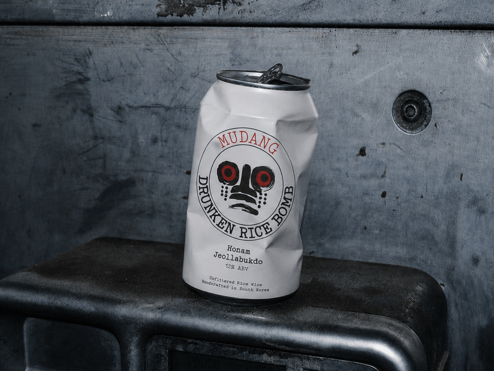
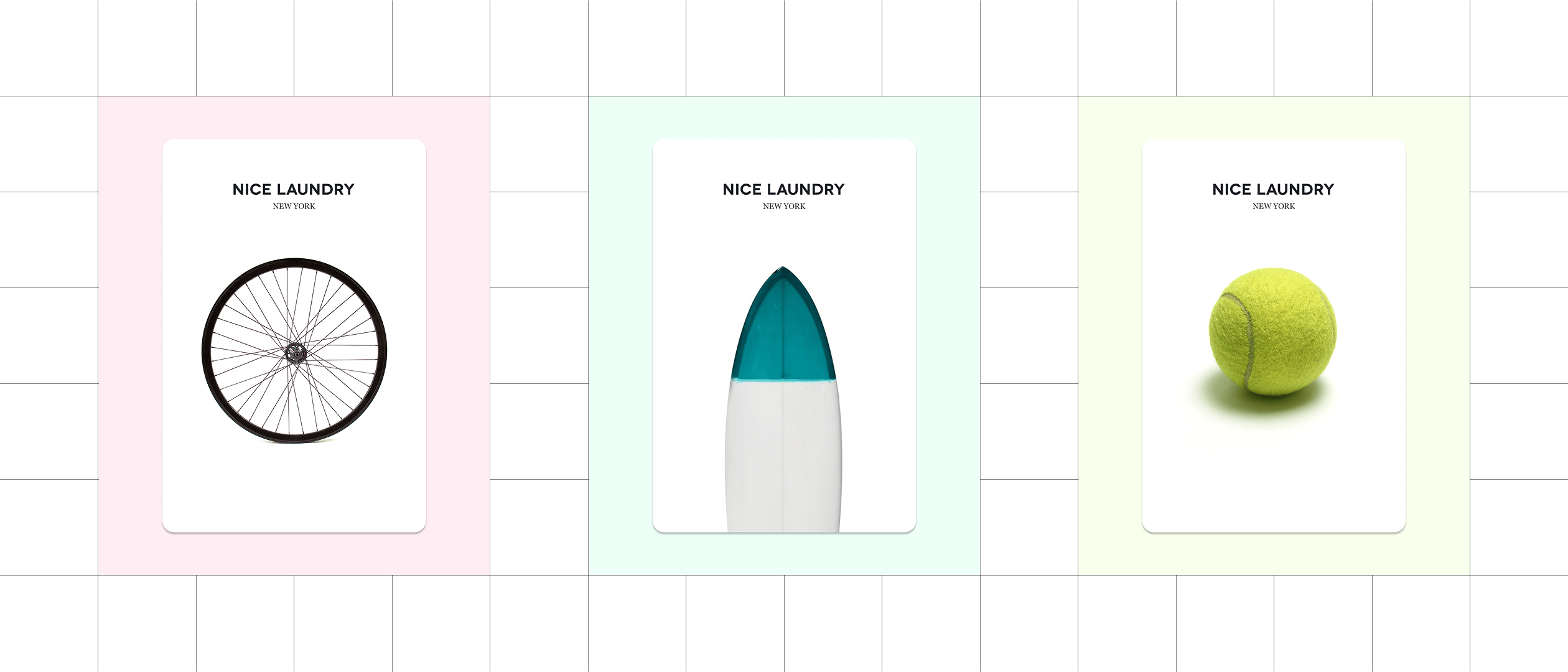
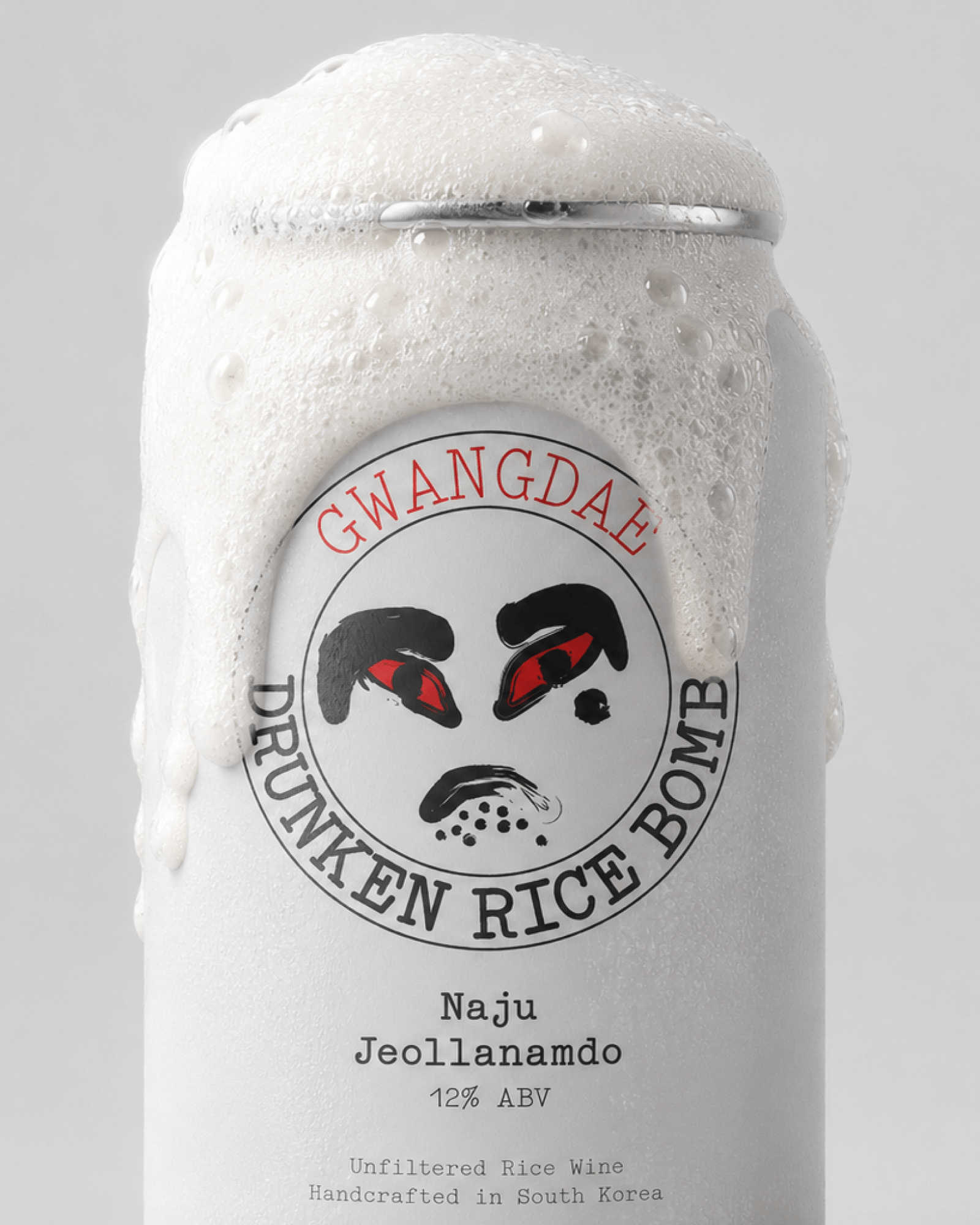 drunken/thumb.png · 4:5
Drunken Rice Bomb
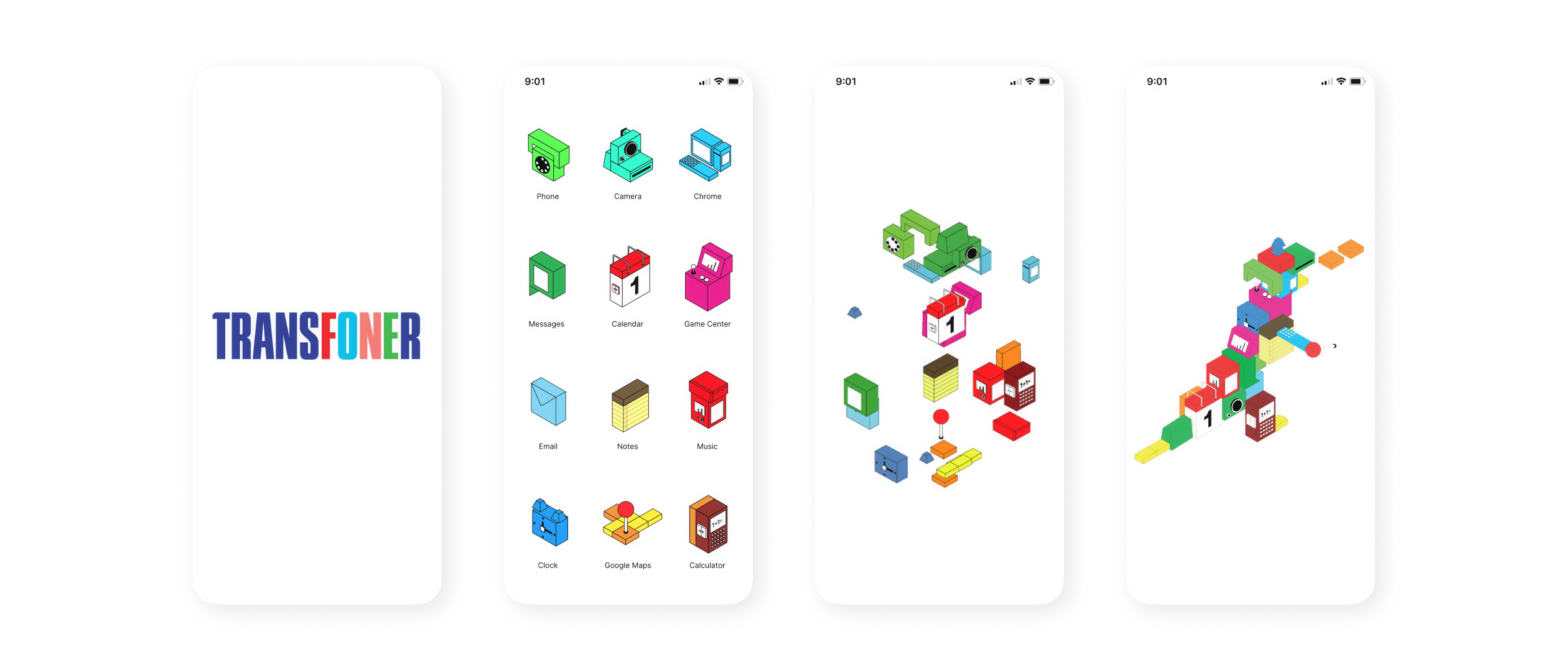
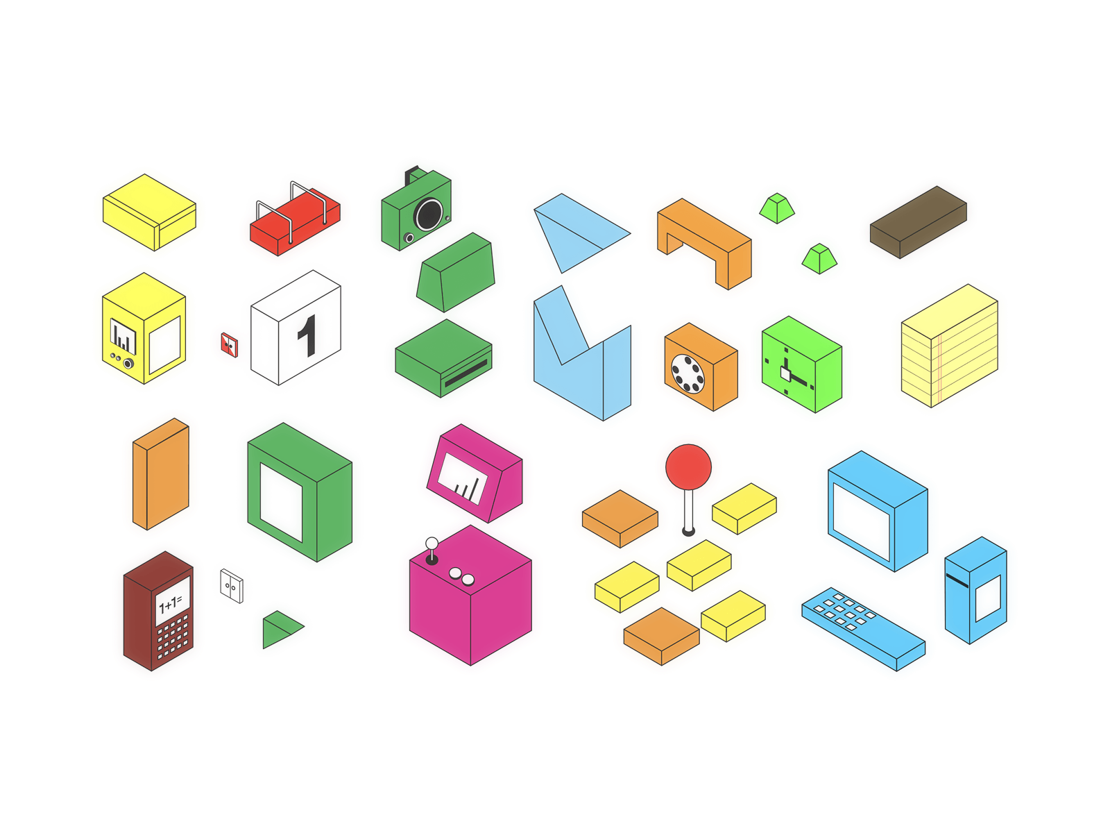
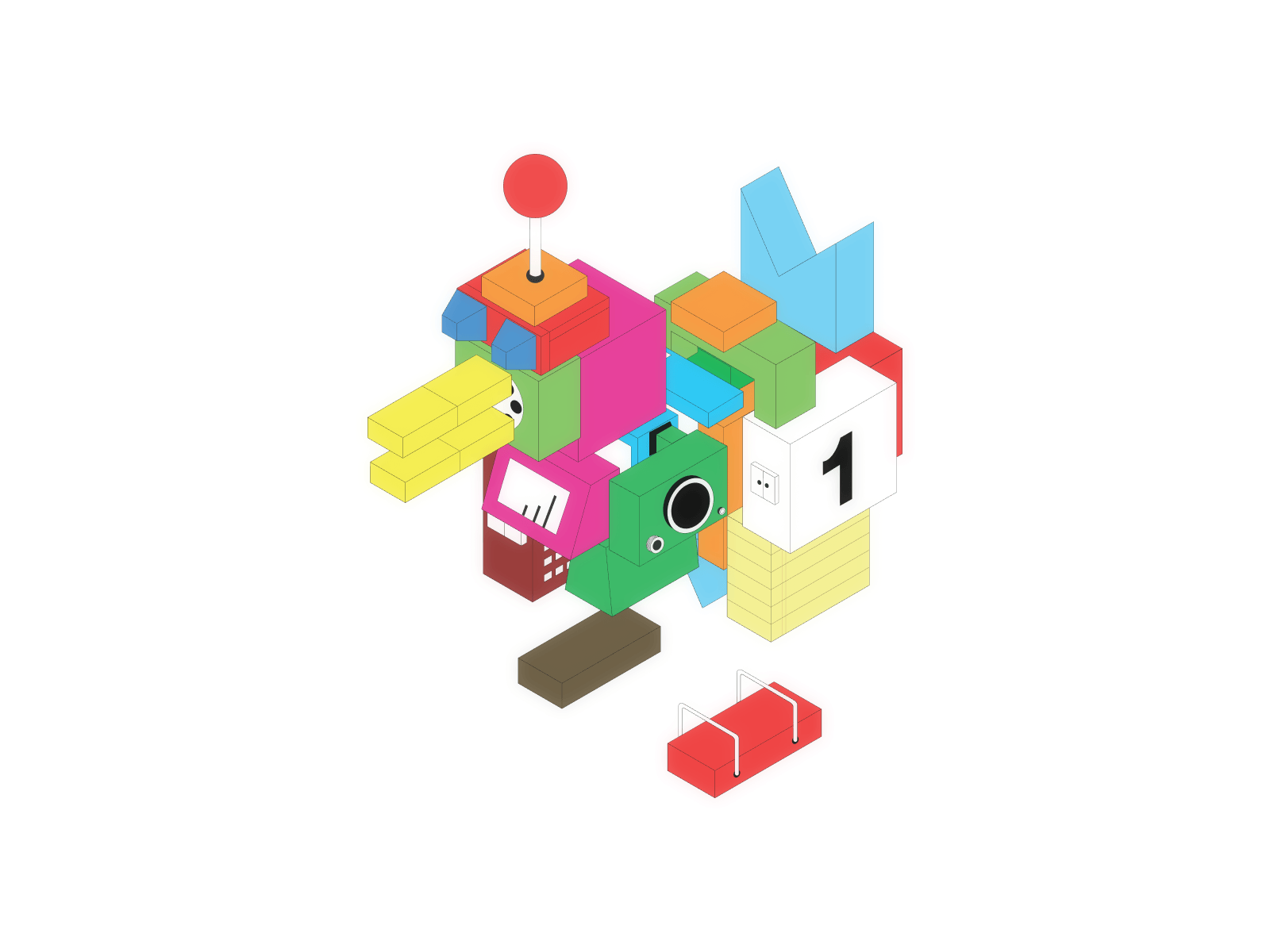
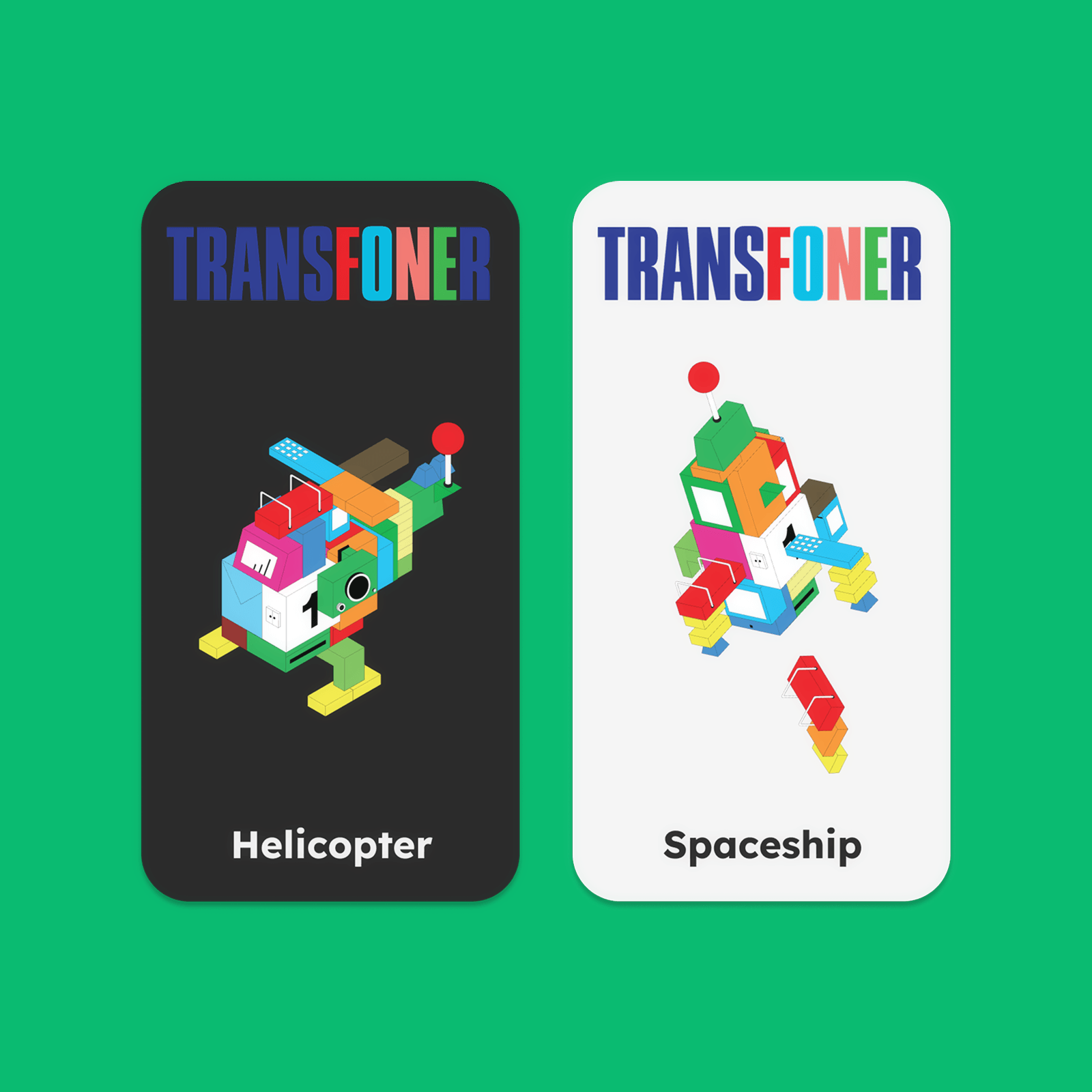
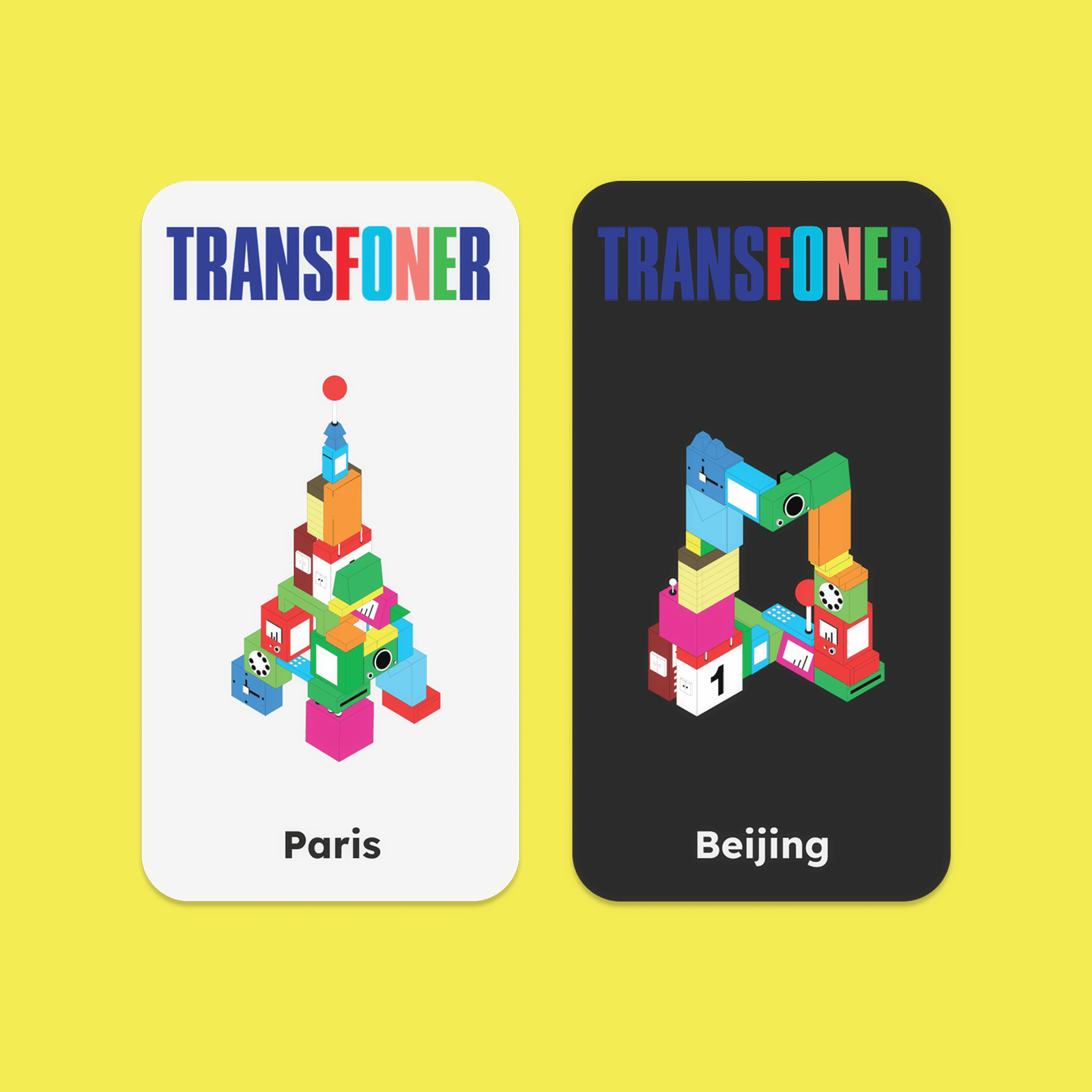
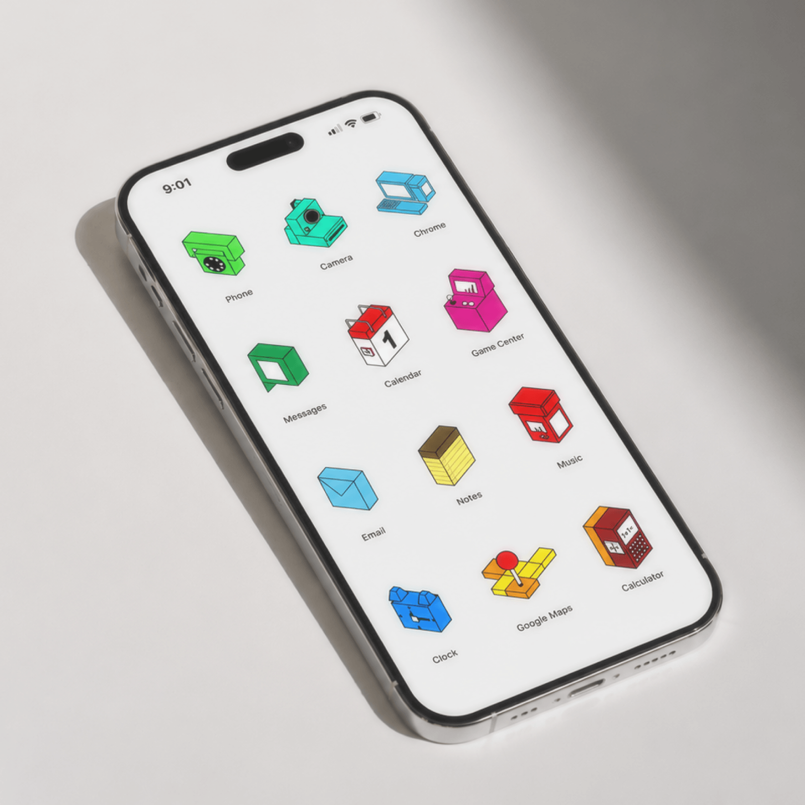
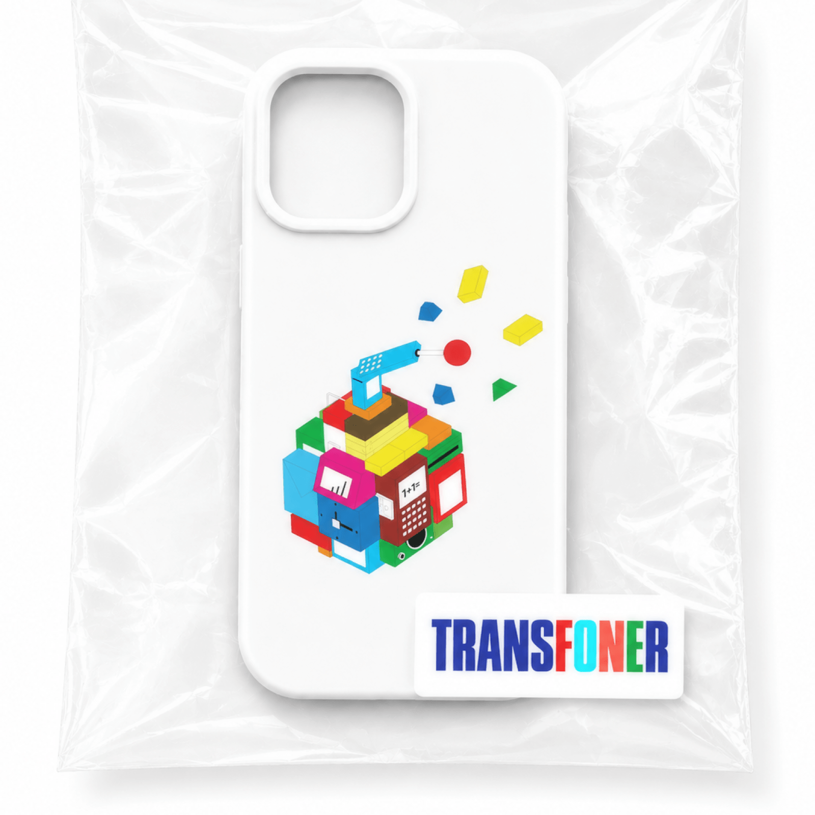
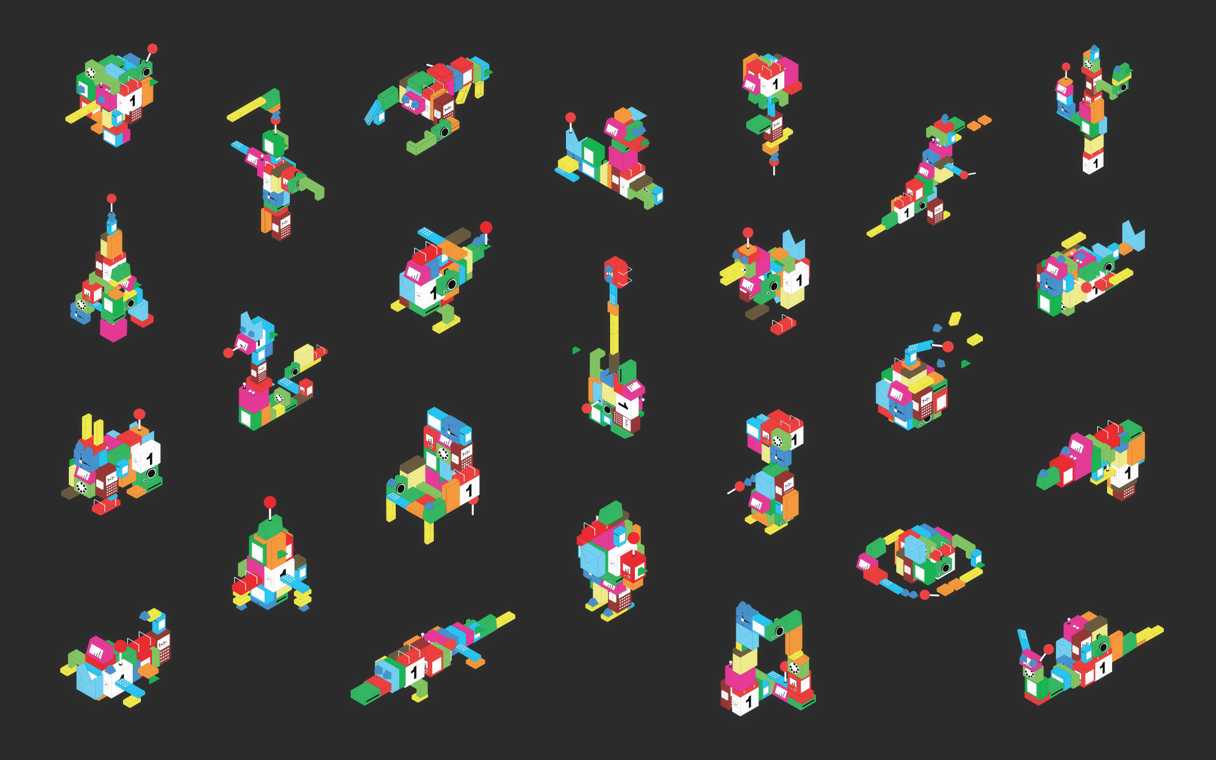
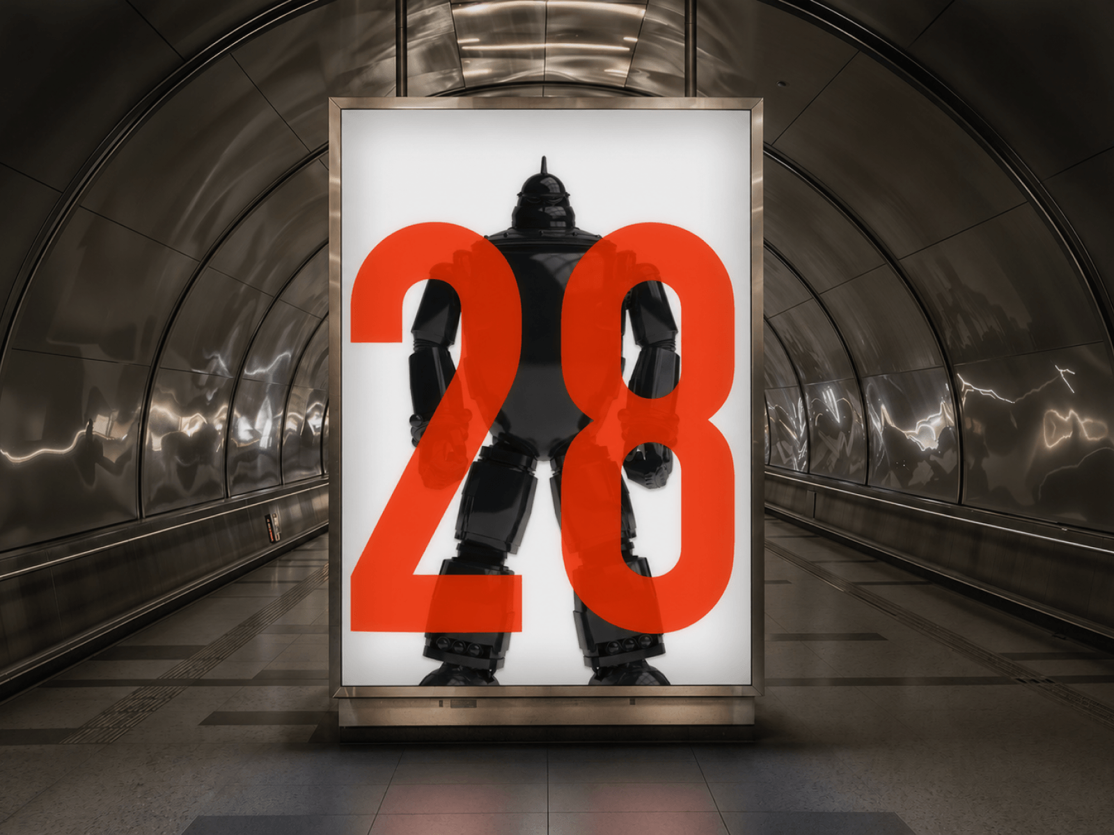
 transfoner/thumb.png · 1:1
Transfoner
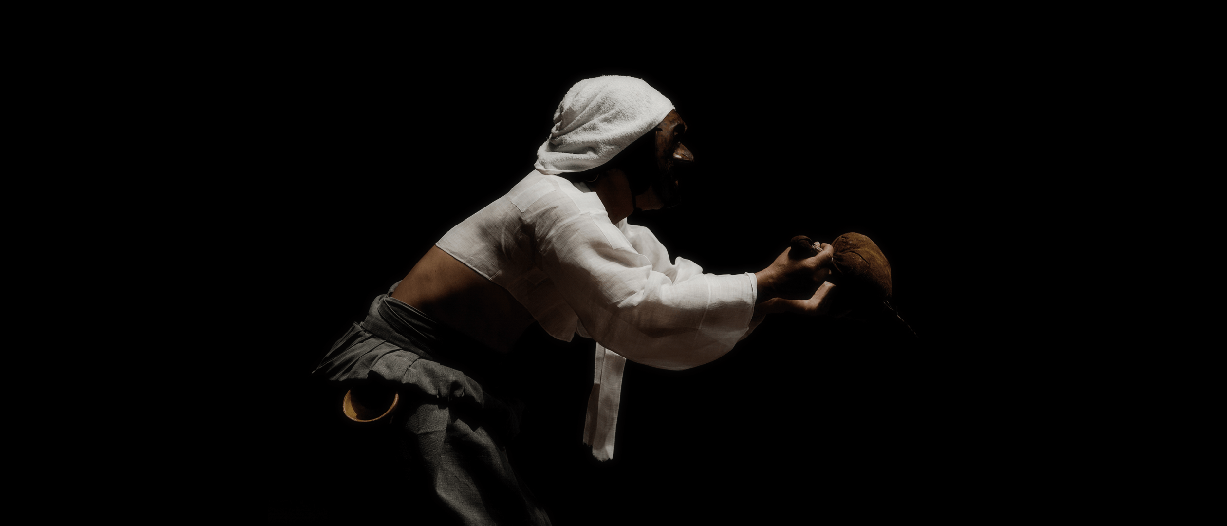
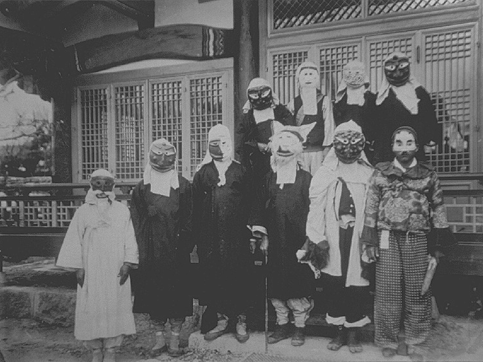
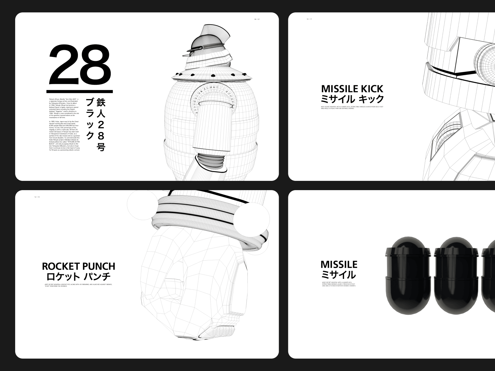
 misc/thumb.png · 4:5
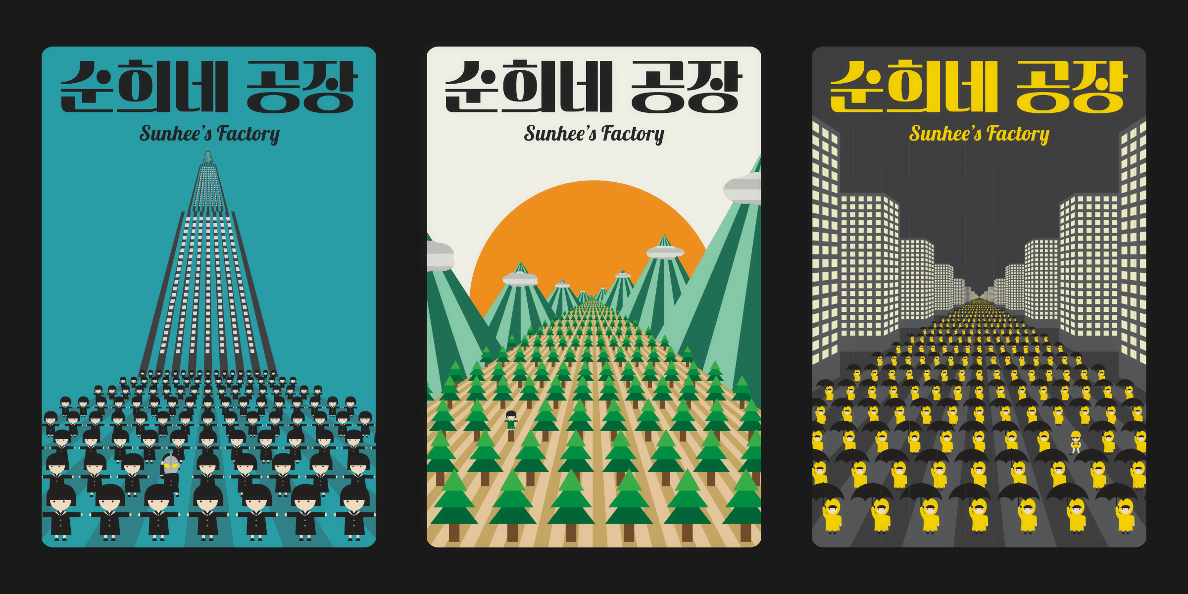
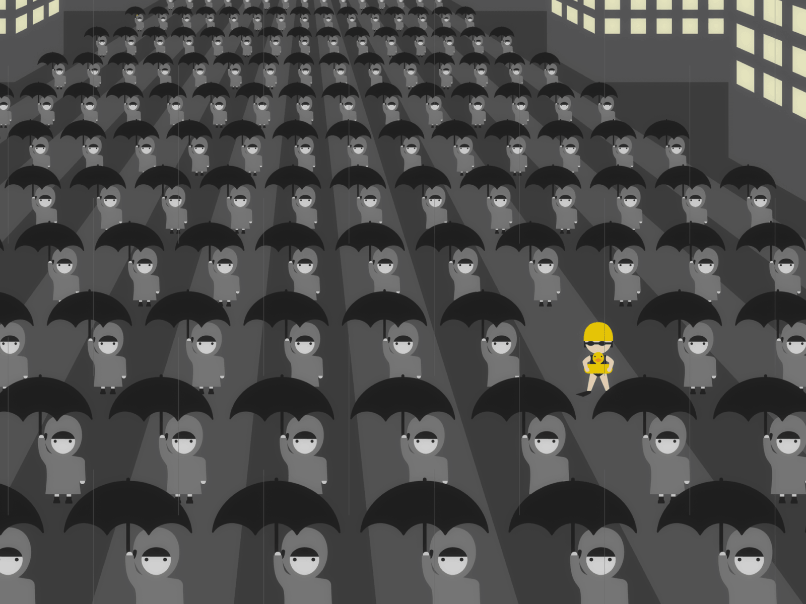
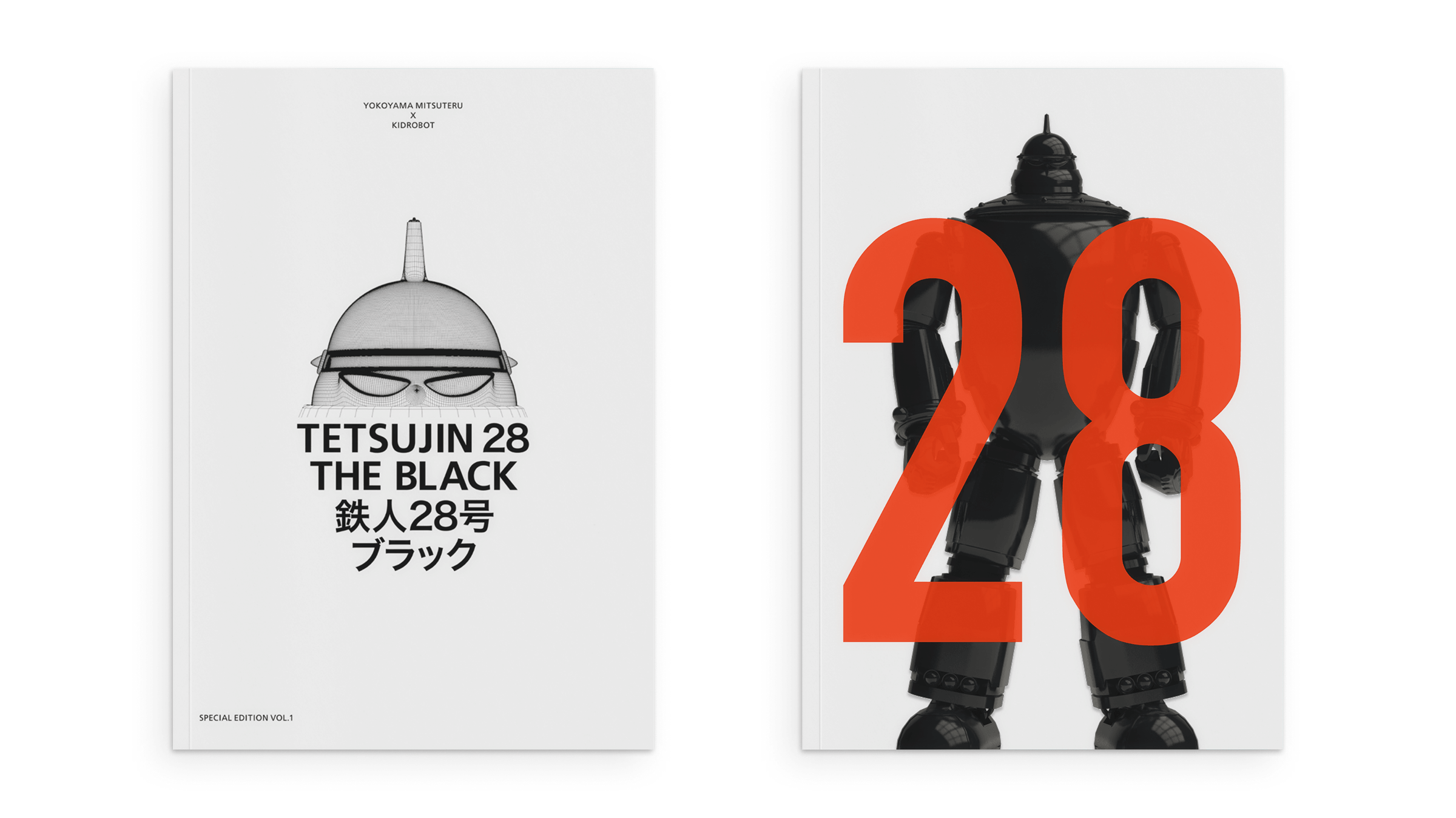
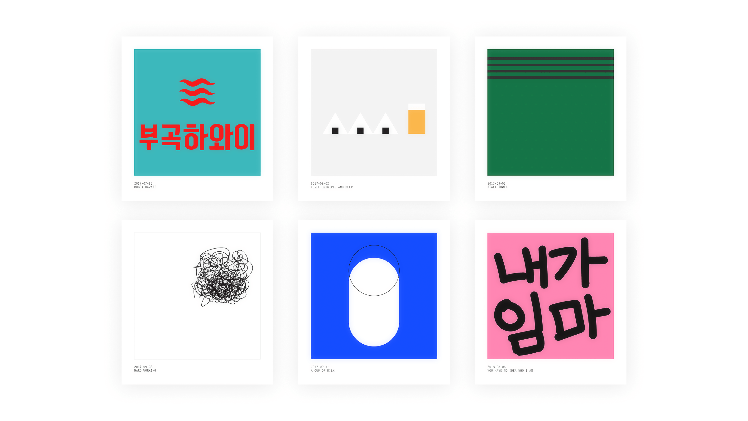
Miscellaneous